[button link=”https://www.arredanegozi.it/2014/08/doctor-manzana-valencia/” icon=”none” target=”” color=”a30b0b” textcolor=”ffffff”]TESTO ITALIANO[/button]
Masquespacio presents their last Project realized for Doctor Manzana, a store specialized in technical service for smartphones and tablets, besides being a seller of design gadgets for mobile devices.
The project consists in the redesign of Doctor Manzana’s branding and the realization of the design for their first point of sale located in Valencia, Spain.
The project starts from the necessities from Doctor Manzana’s brand to open their first physical point of sale after the great success reached through their technical service offered until now only online in Spain.
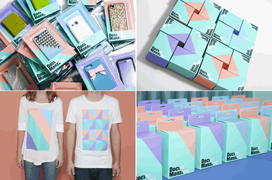
Due to the growth of the company in first case design studio Masquespacio redesigned the graphic identity of the brand with the purpose to strengthen the identity and apply it to the point of sale. The logotype starts from the principal axe of the company ‘the touchscreen’ and his reflection that creates an angle of 54 degrees.
That angle ends being part of the whole communication and his defragmented into different applications that create an infinity of forms able for the graphic and interior design. Ana Milena Hernández Palacios, creative director of Masquespacio: “Talking about the colors as we started from a company name allied with a doctor we wanted to create a concept based on a hospital, however as we didn’t want to create a conventional design, we discarded this option, but maintaining blue and green colors as a reference to the first word in the company’s brand name.”
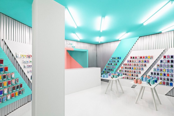
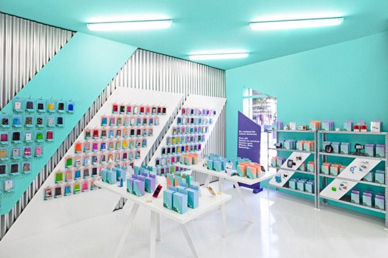
Looking at the store everything starts from the striking façade that incorporates the same angles and colors like for the graphic identity. The blue and green colors like a reference to the doctor, the salmon color for the fashionistas and the purple for the freaks. Both windows contain texts like.
Entering at the store, the interior design shows a graphic design with fresh funny colors and a bunch of angles appearing continually in their original form or defragmented, making reference to the reflection of the touchscreen. Materials like the galvanized steel sheets are doing their more industrial work in the space, while white furniture is offering a light warm touch to the whole.
Meanwhile, the different pastel colors bring the diversion part of Doctor Manzana’s identity to the space. Masquespacio through this Project shows again that creativity has no limits and that high budgets aren’t needed to obtain an explosive result for brands looking to transmit a sober or a funny image like in this case with Doctor Manzana.
Client Doctor Manzana
Location Valencia
Area 40 sqm
Design Masquespacio
Designer Ana Milena Hernández Palacios
Graphic design and interior designed Ana Milena Hernández Palacios
Photos courtesy David Rodríguez