Sergio Mannino Studio designs a new brand identity and a store for A.MANO Brooklyn, a home-décor shop in Brooklyn, New York.
A.MANO Brooklyn is a Brooklyn-based home decor shop owned by Katherine Wells, merging the retail of locally-made ceramics, art, and up-cycled fine furniture.
The shop creates a hub for artists, Brooklyn residents, and retailers to collaborate and allow local art to be accessible on a larger scale. In addition, A.MANO is partnering with BKLYN CLAY, a ceramic school/workshop located right next door. This collaboration fosters the promotion of local art, and the sales of the pieces will benefit both entities.
Katherine Wells has inspired the Studio to create a vibrant, welcoming space full of artistic references that she cherishes dearly. Brooklyn has a new booming spot to keep the community active and inspired.
Store Design
The unique and modern store combines various design aesthetics from 80s Italian Design to minimalist to industrial, drawing inspiration from iconic artists and designers such as Donald Judd and the Milanese Memphis group.
This project incorporates Mannino Studio‘s dual heritage: the Italian Radical Design on one side and the American minimalism on the other. Sergio Mannino trained with Ettore Sottsass at the beginning of his career before moving to New York in 2001 to open his own design studio. In 2002, he presented a series of furniture at the Memphis-Postdesign Gallery in Milan, once again under Sottsass’ mentorship.
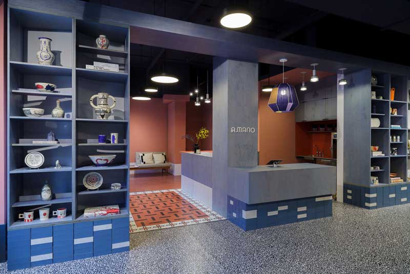
The interior is distinctly divided into three different spaces, each with its unique feel. The main goal of the design was to create a progressive flow and allow for different experiences for each of the clients.
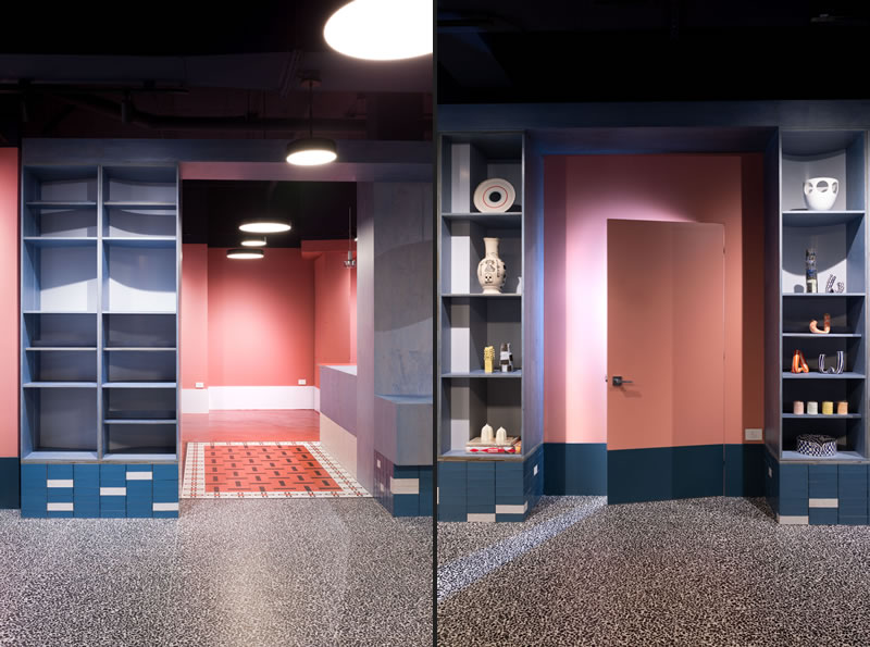
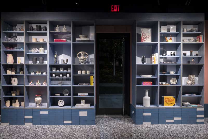
The main gallery is an eye-catching place featuring blue-stained plywood shelving sitting on a base of blue and white glazed bricks, together with a black and white terrazzo floor.
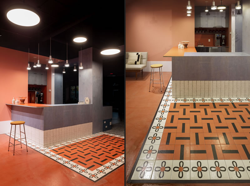
The coffee area on the left has a more intimate and homey feeling, displaying a bolder terracotta/orange tone on the floor and the walls. Here, the counter space is emphasized by the Mutina tiles, designed by Nathalie Du Pasquier, which the Studio used to create what seems to remind us of a ceramic rug on the floor.
Lastly, the back room is a relatively more neutral area where the store will periodically show rare and valuable vintage furniture from different eras. It has a blue concrete floor and two large windows overlooking a garden.
The whole space is characterized by a 16″ baseboard aligned with the top of the glazed bricks. The “baseboard issue” is recurring for many architects, with some trying to remove it entirely using just a reveal.
The Studio opted for a bolder solution to make it a strong presence in the space, painting it in contrast with the wall behind.
Brand Identity
The brand identity has been conceived as a natural extension of the store design. The Studio created a logo characterized by two very different letter A’s: the first one being bold and playful, representative of the brand’s characteristics, while the second one aligned with the rest of the typeface.
The main A becomes a Logo Mark that can be used independently, with or without the Brooklyn tag, in a framed square or a solid background. The A is from the typeface Lyno by Radim Pesko.
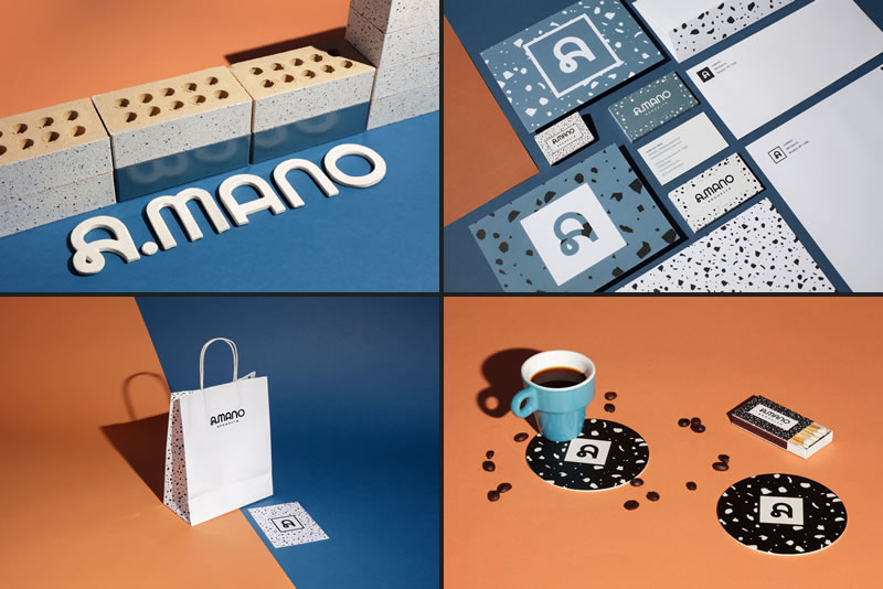
The brand’s primary colors are Black, White, and Smoky Blue, all three reflected in the floor and glazed bricks materials. They have strong character, with contrasting tones and a bold presence.
The brand’s secondary colors are a lighter version of the shades used for the interior space, with the addition of a light green shade.
These colors evoke feelings of warmth, comfort, and nature. They evoke naturally painted surfaces, and feel contemporary without breaking with tradition.
The main logotype for the brand is Avenir, a sans-serif typeface designed in the 80s by Swiss designer Adrian Frutiger. It is a harmonious and sensual font that perfectly fits A.MANO, giving the brand a delicate feeling without being overly present. In the words of its designer, “The whole point with type is for you not to be aware it is there. If you remember the shape of a spoon with which you just ate some soup, then the spoon had a poor shape.”
Location 585 Dean St, Brooklyn, NY 11238
Area 167 sqm
Design by Sergio Mannino Studio
Interiors Sergio Mannino, Martina Guandalini
Identity Sergio Mannino, Martina Guandalini, Brian Biles, Jan Habraken