[button link=”https://www.arredanegozi.it/2023/02/progetto-farmacia-del-carrilet-reus-spagna/” icon=”none” target=”” color=”a30b0b” textcolor=”ffffff”]TESTO ITALIANO[/button]
Farmacia del Carrilet is a project signed by the spanish studio Marketing Jazz.
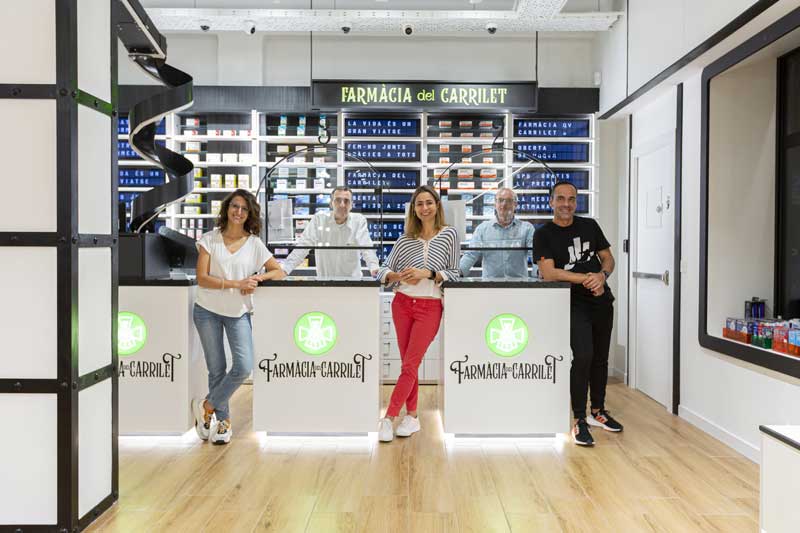
“Life is a great journey, let’s go on it together”, is the pharmacy’s slogan and the phrase that Lucia Conde Peiro, the in-house pharmacist repeated several times during the first briefing. “Our customers are people of various nationalities; immigrants, a working-class neighbourhood, and we want to offer them the best, be there for them in their lives”.
The creative concept “All aboard the health express” emerges from this.
It’s an idea that highlights the pharmacy’s unique selling point, one on which we build the design of the space, the brand and the product presentation, all with the same image. – tell the designers – This is the key in our retail projects. Clear ideas and a clear image go hand in hand. We never make two pharmacies the same; we don’t even repeat the furnishings; everything is bespoke. After all, are any two dreams the same? We are the best when it comes to translating in visual terms our clients’ business dream into a commercial space!
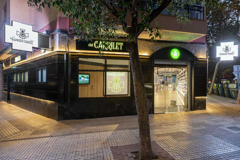
A TRAIN FOR A SHOPFRONT
A chamfered shopfront, over 20 metres long: how to transform it into a train? By working on the basis of a horizontal design. And with a design that will respect the building’s architecture, its materials, and at an affordable price. And if we focus on the windows? And if we imagine a train of yesteryear? And how about using sheet metal panelling? And what if we back the design concept with lines and rivets? And what if the signage design were inspired by the signs of railway stations? How about creating boxes of light in our windows to present to our customers? A senior citizen? A hard-working woman? A child with their pet? What´s more, a locomotive takes pride of place; now we have it, there´s our shopfront!
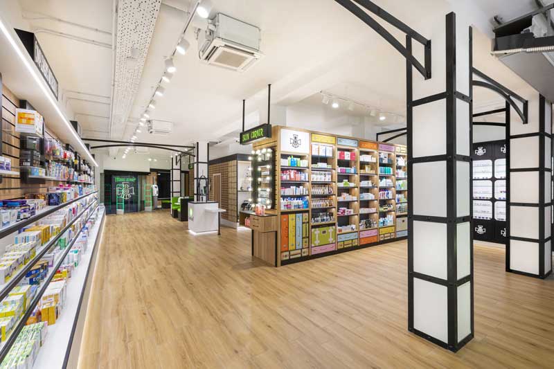
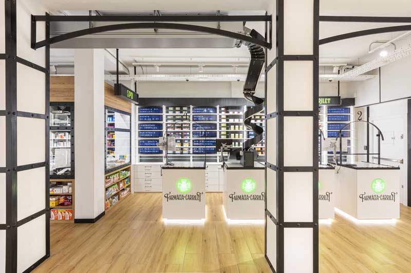
THE ENTRANCE TO A STATION
The columns and metal arches on the pillars set up the scene. The wooden walls and floor give it a warm and cosy touch. A logo like a wall, designed to be seen from outside and to be its photocall inside. To the left, the waiting area. The white ceiling, the installations in plain sight, the shelves and counters also white, combined with the LED lighting make you feel good.
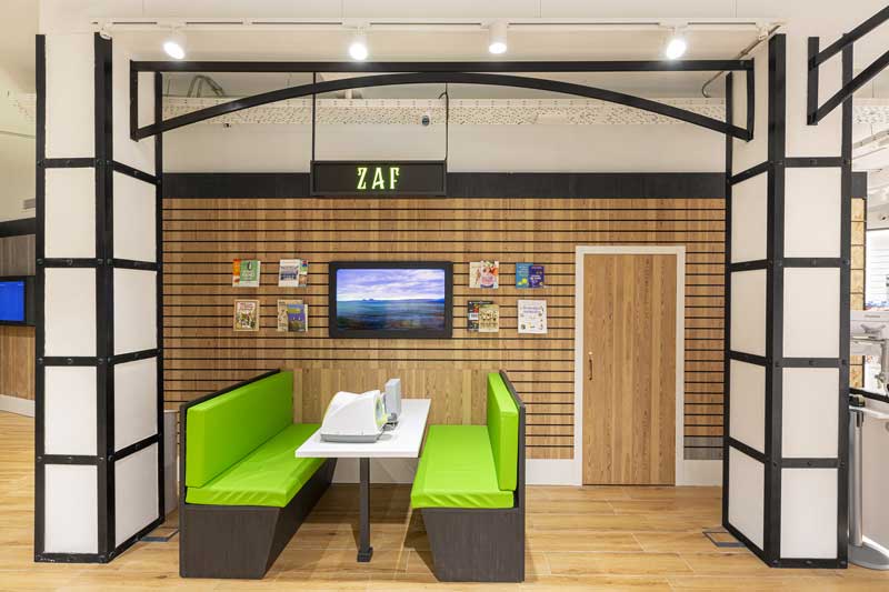
TAKE A SEAT (ZAF)
Was created a very special Pharmaceutical Service Area (ZAF, in its initials in Spanish), it´s inspired by the seats on a train. With a window where, through a TV screen, we see images of landscapes pass by seen from a train. The table is the place to get your blood pressure taken, receive advice or simply pass the time reading about health and wellness while you wait. The wall, fitted with slotted profiles, host a door that provides access to a washbasin to clean up.
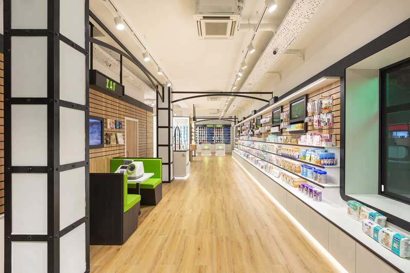
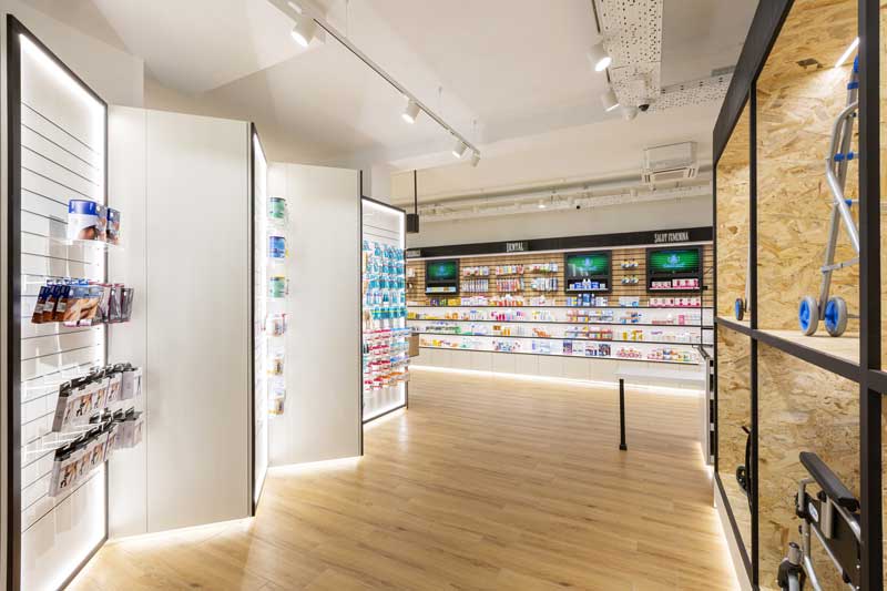
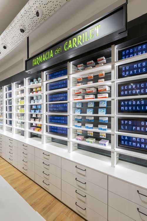
THE RIGHT-HAND WALL: A RAIL CARRIAGE
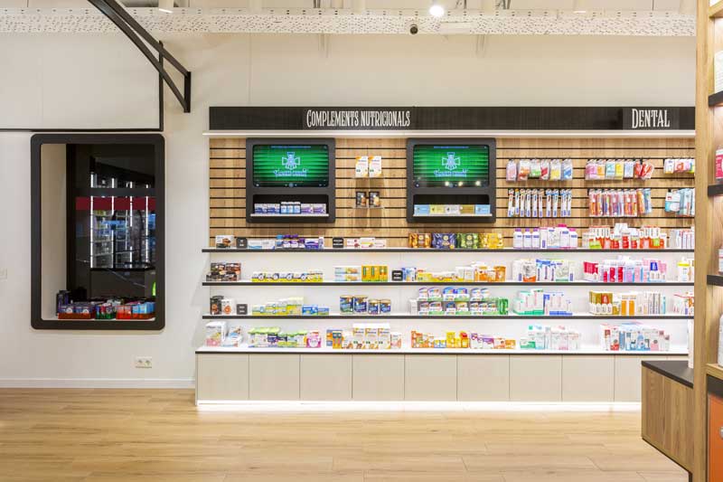
The pharmacy´s longest wall takes its inspiration from a rail carriage. Product presentation on three levels. The upper level for digital communication, screens set in frames like windows to evoke the image of a train carriage. Communication is treated as if it were a product. This level is also devoted to serving as an exhibition guide and highlight a promotional campaign. The next level is formed by three continuous shelves to present products. And finally, a module with a storage space, in whose upper section we place the bulkiest items. This wall is devoted to three categories, mainly: children, women´s health, dental items and nutritional supplements.
THE MOBILITY ZONE
Farmacia del Carrilet makes a clear commitment to mobility, to enhance the lives of our senior citizens. An autonomous space has been designed, at the entrance to the pharmacy, on the left. It goes without saying that this type of purchase requires a different pace, a different kind of experience, and for this reason a display with one wing has been made so that people in wheel chairs can receive the service they deserve.
The design concept of this unit is based on the small orthopaedic product. It is a wall designed in a zig-zag shape that invites movement, not just in the product presentation but in the way one moves through the space. The idea behind the design of this unit is that one can see all the categories clearly and in focused way from the entrance. The wall on the left is fitted with large containers for presenting wheelchairs, walking frames, sticks, etc. At the back, a green chair for waiting or for trying out the product in as pleasant a way as possible. A large window with a one-way mirror and the logo with light at the back rounds off the image of this space.
SKIN STOP: THE STOP FOR BRAND ANIMATION
Skin cosmetics brands call for a place where they can present their products. Customers need a clearly demarcated space to enjoy these products when they are trying them out. A stop in one of the hottest zones of the pharmacy, right in the zone where queues begin to form, in the transition between the mobility zone and skincare zone. A mirror with light bulbs takes us to a changing room. A high table to offer the service and try out the product.
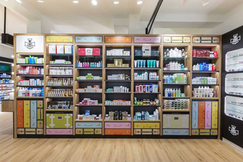
THE DERMO WALL, THE BEAUTY BAGGAGE
The designers approached the dermocosmetic category in a different way. Think the passengers, with that taste of the era in which travel was a sign of distinction and style. When one´s suitcases told you a lot about the person. And beauty was part of your style, beyond brands, class or social standing. This wall is treated as if it were a painting, a work of art, which makes you feel good and want to buy.
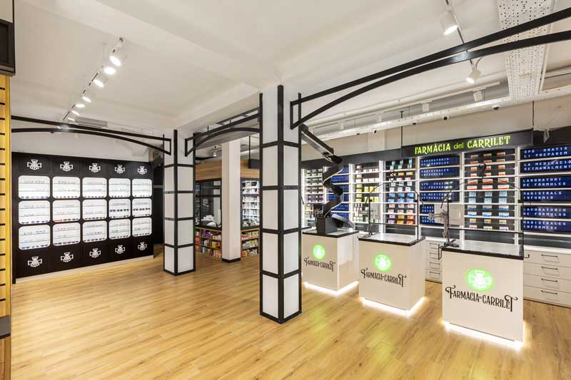
THE OPTICAL WALL, THE WORLD THROUGH A LENS
An elegant design, timeless, with power and clarity to present a product with little tangible body, that is hard to display. The realisationreflects the eyesight in the sphere of health by the creation of a grid pattern, inspired by the windows of the rail carriage. This connection created the sales zone. Each grid has two detachable glass shelves to allow for the presentation of other products related to this category. As well as the higher and lower zones, those where the logo is displayed, there is space to store more products.
THE SPD BOOTH
This is the novel feature of this retail project which combines the Monitored Dosage System space (SPD in its initials in Spanish),that is visible in the sales room. The same zone brings together the robot, the SPD room and the counter. The customer is aware of the personalised service of their medication dosage. A service that is on the rise, one that won´t stop growing as the population ages and the trend in the use of medicines is towards sustainability.
THE EFP WALL, YOUR HEALTH DESTINATIONS
The medications wall, the one that gives meaning to the whole pharmacy, has been positioned at the back of the shop floor. Remarkable the integrated digital screens in the design and purchase experience. It advertises the health destinations of Farmacia del Carrilet using a digital display system reminding the mobile alphabets used in the past.
Three display units whose design conjures up the copper ticket offices of an old-time train station. Numbered and with a glass partition to accentuate the health aspect that has come to stay as a result of COVID-19.
THE KIDS ZONE, A FREE SPACE AND TV!
Children deserve to have free space. The demand to have room for themselves. A sofa and a TV with children´s programmes are perfect to keep them happy. The chosen place is the entrance, on the left of the pharmacy. Children form part of the shop window creating a lovely atmosphere.
THE LIGHTING AND THE MATERIALS OF THE CONTACT POINTS
Light is one of the most important design elements of this retail projects. The technique used is always the same and is simple: to light by layers, guide the customer as they move through the space, make the customer feel good and get a clear view of the products. LED lighting in different formats, using LED strips for the furniture and swivel projectors suspended from the ceiling.
The materials that come into contact with the customer are imitation wood ceramic flooring; furniture made of melamine with a range of imitation wood finishes; Corian box-shaped display units; columns with metal profiles.
These materials have been selected to convey the attributes of warmth, quality, professionalism and value for money (a good quality/price ratio).
PRINT AND DIGITAL COMMUNICATION
Large-format for print communication and small-format for digital.
The serenity of printed communication to present an image on the shopfront that is more appropriate to the brand and its branding. And a digital and nimble communication for the inside. More suitable for the different sales paces: promotional campaigns, messages and the desired purchase experience. Printed communication on the shopfront using backlit vinyl. And the digital communication via 20 screens distributed throughout the entire pharmacy.
VISUAL MERCHANDISING: ANOTHER ELEMENT OF BRANDING
The visual merchandising. The product positioning is key for defining and maintaining the Image. The visual merchandising offered is based on clustering in “blocks of three”.
Location Reus, Spain
Area 150 sqm
Design Marketing-Jazz, Carlos Aires
Architect German Mínguez Martínez
Builder GM Proyecta Coordinación y Contratas
Furniture Muesco. Jose Antonio Sánchez
Lighting Leds Live, Nuria Torrents
Shopfront and signage Sintek, Pablo Lence
Photos courtesy Lupe Clemente