
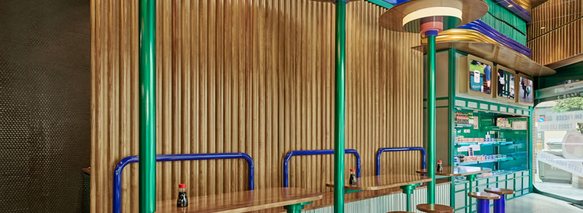
For Kento, a Valencia-based chain specialising in Japanese takeaway food with a particular focus on sushi, Masquespacio designed a 100 sqm interior where colour, wood and references to Japanese culture shape a distinctive hospitality environment.
The project is the third Kento location designed by Masquespacio and, at the time of its completion, the largest of the three. Its greater surface area accommodates additional seating as well as a larger refrigerated display and kitchen, while the existing architecture provides two defining features: a high ceiling and a fully glazed storefront.
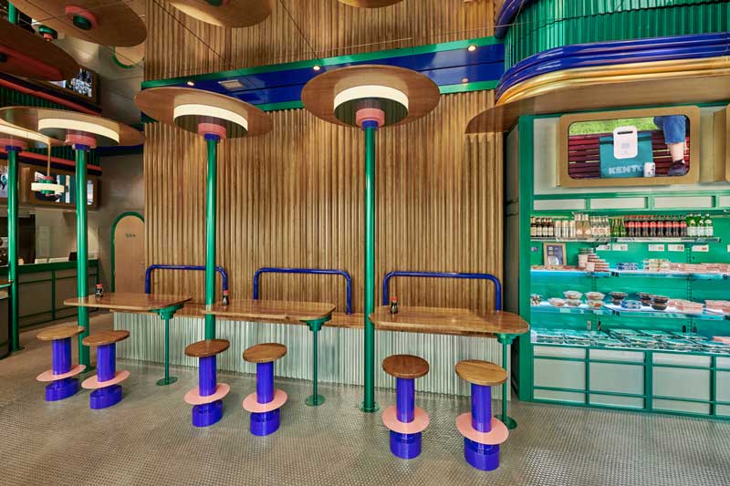
The interior opens towards the street
Masquespacio uses the proportions and openness of the existing space as a starting point for the interior design. The original ceiling height is preserved, while a mirrored surface above visually extends the vertical dimension and multiplies the suspended elements within the space.
The large glazed façade plays an equally important role in the layout. Most of the tables are oriented towards the exterior, establishing a direct visual relationship between the dining area and the street. Rather than separating the restaurant from its urban surroundings, the configuration uses the storefront as part of the customer experience.
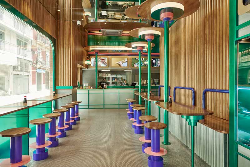
Colour, wood and Japanese references
The material palette combines grey mosaic tiles on the floor and selected wall surfaces with the brand’s distinctive colours. Green, purple and pink appear across the furniture, structural elements and lighting details, creating a vivid contrast with the more neutral architectural surfaces.
Closely spaced semicircular wooden strips cover large sections of the walls. Their vertical rhythm recalls bamboo and introduces a warmer material presence into an interior that also incorporates metal and ceramic surfaces. The reference to Japanese culture is therefore expressed through selected forms and details rather than through a literal reproduction of traditional motifs.
A new interpretation of Kento’s visual identity
Compared with the previous Kento interiors, the design limits the use of gold and gives greater prominence to the brand’s green and purple tones. Custom tables and stools develop this palette through simple geometries and contrasting surfaces, while the repeated circular elements establish a recognisable visual rhythm throughout the dining area.
The service counter completes the composition. A wooden structure above it references the character of Japanese roadside food stands, translating this inspiration into the contemporary visual language developed for Kento. Together with the mirrored ceiling, the large storefront and the strongly defined colour palette, it contributes to an interior in which brand identity and spatial design are closely integrated.
Project credits
Project: Kento
Location: Valencia, Spain
Area: 100 sqm
Interior design: Masquespacio