
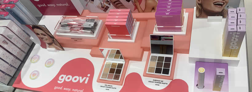
Goovi introduces its new retail display concept for the physical retail sector with a project designed by Grosso Audisio Architetti. The cosmetics brand, already established in online sales, translates its identity into physical spaces through a retail corner conceived to express the “Good vibes” mood through light, color, movement and visual communication.
The Goovi retail concept translates the Good vibes mood into physical space
The name Goovi originates from the concept of “Good vibes”, a direct reference to the brand identity and its positive communication approach. This principle also becomes the starting point for the retail project, developed to give physical form to the brand personality inside the store environment.
The retail corner interprets the brand language through luminous surfaces, recognizable colors and shapes capable of generating an immediate visual presence. The goal is to create a display system consistent with the Goovi identity while remaining integrated within the atmosphere of the perfumery hosting the installation.
Light, color and movement define the new Goovi display system
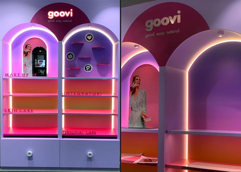
The new Goovi display, designed by Grosso Audisio Architetti, combines bright lighting, color and movement to harmonize retail surfaces. The graphic concept translates the visual identity of the brand into a recognizable and functional retail structure.
Pastel colors and unusual archetypal forms characterize the counter, allowing it to emerge within the perfumery environment without disrupting the relationship with the surrounding retail space. The result is a playful and youthful system designed to communicate dynamism, transformation and proximity to contemporary trends.
Display elements organize products, visual merchandising and campaigns
The shelves are enriched with decorative objects and podiums introducing sinuous forms and chromatic accents. These elements reinforce the sense of lightness the brand aims to communicate while contributing to a clear visual hierarchy.
The system was conceived from the beginning to simplify product rollout. Cosmetics are positioned through visual merchandising techniques and a flexible visual communication strategy designed to support campaign updates and category organization.
Color guides customers through make up, skin care, personal care and supplements
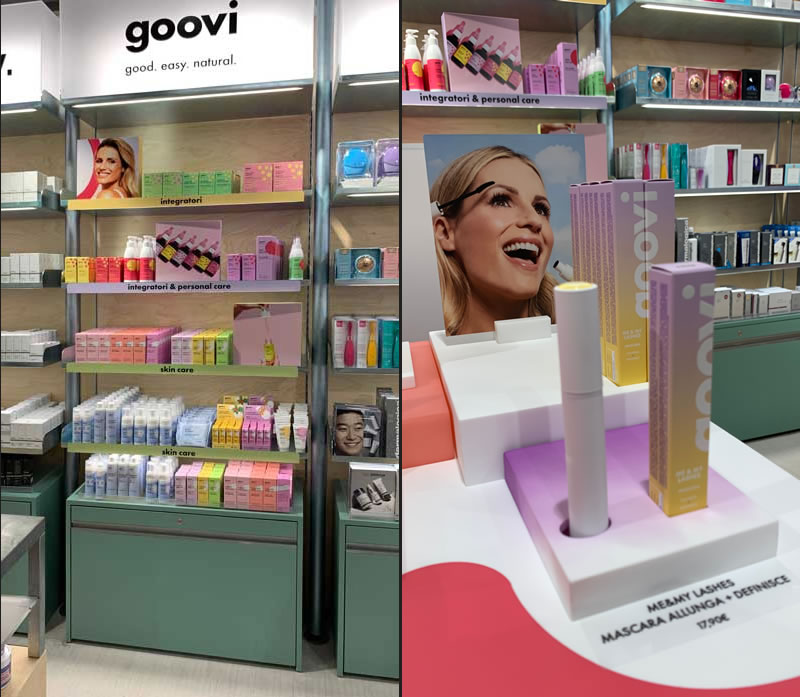
Within the Goovi retail concept, color becomes an orientation tool inside the corner. Purple identifies make up, green skin care, yellow personal care and red supplements.
This chromatic coding helps customers recognize product categories and navigate the assortment more intuitively. Elements connected to the concept of Self Love also introduce interaction points for consumers, strengthening the relationship between brand identity, products and retail space.
Design: Grosso Audisio Architetti
by AN Shopfitting Magazine no.166 ©