
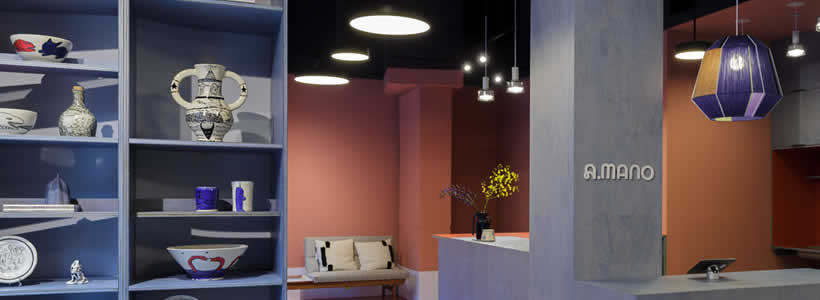
A.MANO Brooklyn, designed by Sergio Mannino Studio, is a home décor store located in Brooklyn, New York, combining locally made ceramics, art and up-cycled furniture within a retail environment shaped by Italian Radical Design and American minimalism. Conceived as both a commercial and community space, the project integrates retail, hospitality and local artistic collaboration into a layered interior identity.
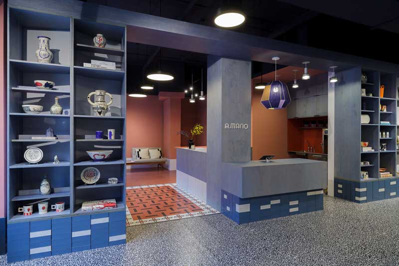
The store combines local craftsmanship, ceramics and community-oriented retail
A.MANO Brooklyn was created as a platform connecting artists, local residents and retailers through the presentation of handmade ceramics, furniture and art pieces. The store also collaborates with BKLYN CLAY, the ceramic school and workshop located next door, reinforcing the project’s relationship with Brooklyn’s creative community.
The retail concept supports local production while making independent artistic work accessible within a contemporary commercial environment. The space functions not only as a store but also as a cultural hub centred around craftsmanship and collaboration.
The interior blends Italian Radical Design with American minimalism
The store design combines influences ranging from 1980s Italian design to industrial aesthetics and contemporary minimalism. References to Donald Judd and the Milanese Memphis group contribute to an interior language defined by geometric forms, bold material contrasts and carefully controlled colour palettes.
The project reflects Sergio Mannino Studio’s dual cultural heritage, combining the legacy of Italian Radical Design with American minimalism. Sergio Mannino’s early collaboration with Ettore Sottsass and his later connection with Memphis-Postdesign in Milan directly inform the visual identity of the space.
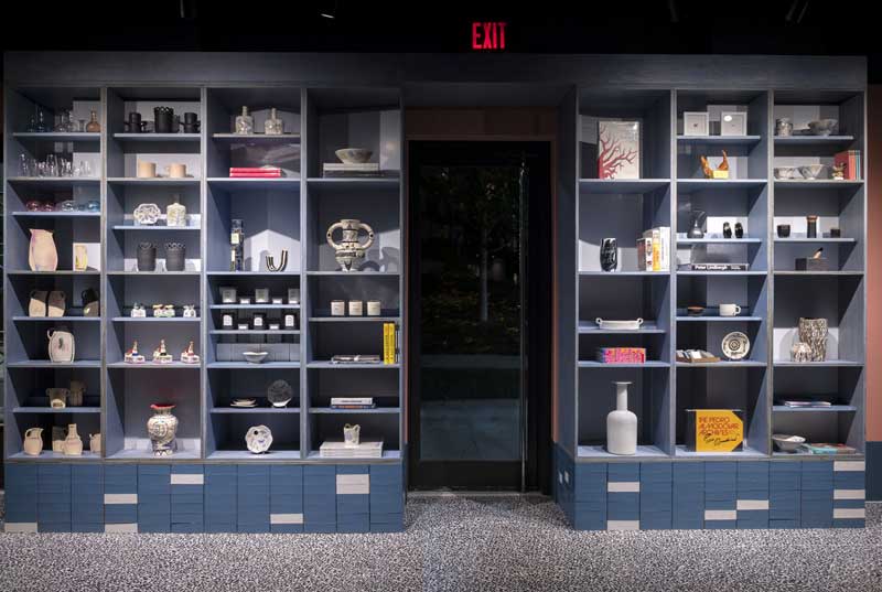
The layout creates three distinct retail atmospheres within the same store
The interior is divided into three different areas, each characterised by its own spatial identity and customer experience. The design strategy focuses on creating a progressive flow through the store while encouraging different forms of interaction with products and displays.
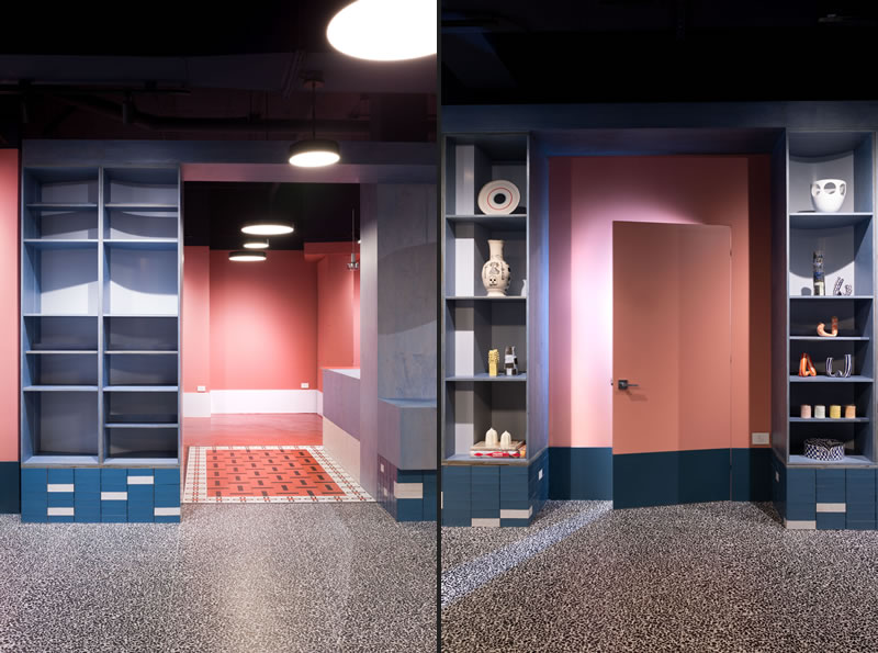
The main gallery features smoky blue plywood shelving positioned on blue and white glazed brick bases combined with a black and white terrazzo floor. This area functions as the visual core of the retail environment.
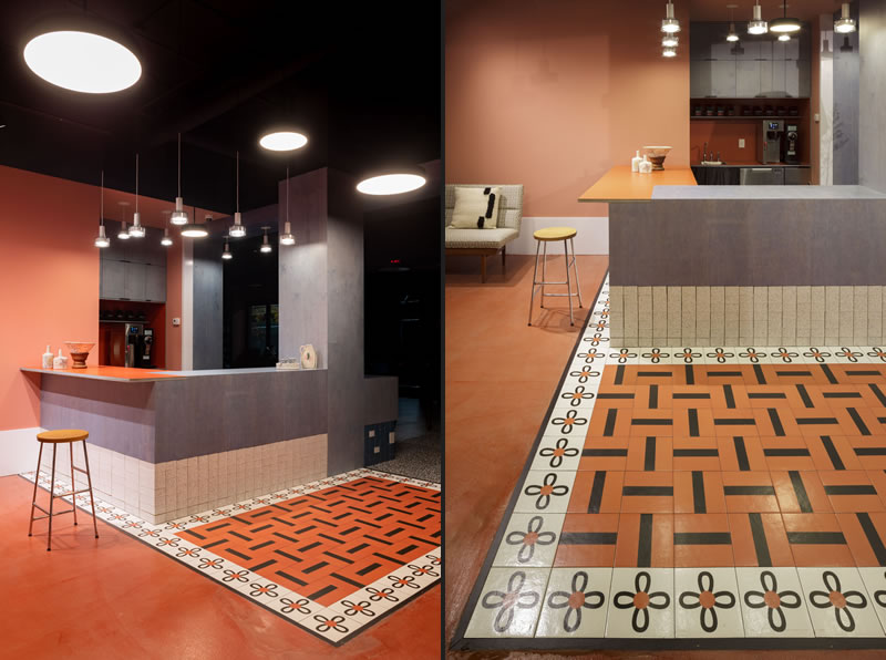
The coffee area introduces a warmer and more domestic atmosphere through terracotta and orange tones applied to floors and walls. Mutina tiles designed by Nathalie Du Pasquier define the counter area and create a ceramic rug effect integrated into the flooring.
The rear room is conceived as a more neutral gallery-like environment dedicated to rotating displays of vintage furniture from different periods. Blue concrete flooring and large windows overlooking the garden reinforce the calmer character of this area.
Sustainable construction methods support the long-term flexibility of the store
The store was designed with a sustainable construction strategy focused on reversibility and material preservation. All fixtures can be disassembled without damaging the materials, and the project avoids the use of glue in favour of screw-based assembly systems.
A continuous 16-inch baseboard aligned with the glazed brick installations becomes a recurring architectural element throughout the interior. Rather than minimising the baseboard, the designers emphasise it through contrasting colours to reinforce its visual presence within the space.
The brand identity extends the spatial language of the interior design
The visual identity was conceived as a direct extension of the store concept. The logo features two distinct letter “A” forms: one bold and expressive, the other aligned with the rest of the typography, reflecting the balance between craftsmanship and contemporary design.
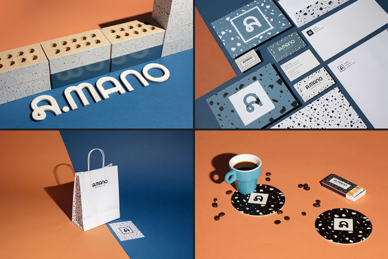
The brand palette combines black, white and smoky blue with softer secondary tones and light green accents. Materials, graphics and colours are coordinated with the interior surfaces to reinforce the connection between brand identity and retail experience.
The main logotype uses Avenir, the sans-serif typeface designed by Adrian Frutiger, selected for its balanced and understated character aligned with the atmosphere of the store.
Location: 585 Dean St, Brooklyn, NY 11238
Area: 167 sqm
Design: Sergio Mannino Studio
Interiors: Sergio Mannino, Martina Guandalini
Identity: Sergio Mannino, Martina Guandalini, Brian Biles, Jan Habraken