
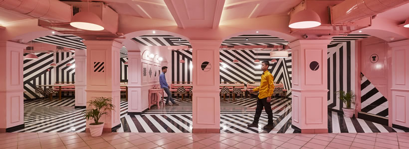
Located in one of Kanpur’s historic buildings, The Pink Zebra is a 371 sqm restaurant designed by Renesa Architecture Design Interiors around a deliberately restricted visual vocabulary: black-and-white stripes, pink surfaces, repeated geometries and strong symmetry.
The restaurant includes a lounge and bar, a dining room and a terrace. Rather than treating these areas independently, Renesa uses colour, pattern and recurring geometries to establish a continuous identity throughout the project.
The starting point was the client’s interest in the carefully framed compositions and controlled colour palettes associated with filmmaker Wes Anderson. Renesa translated these references into a spatial system, combining them with elements related to the historic context of the building and the city.
Black-and-white stripes become an architectural pattern
The most recognisable element of The Pink Zebra is the sequence of black-and-white stripes extending across floors, walls, ceilings and architectural elements.

The pattern is not confined to a decorative surface. By continuing across different planes, it changes the perception of depth and makes the boundaries between individual elements less immediate. Columns, openings and circulation areas become part of the same graphic composition.
Against this monochrome structure, pink provides the dominant colour field. The combination creates a controlled palette in which architecture, graphics and branding become parts of the same visual system.
Symmetry organises the visual experience
Symmetry is another recurring principle. Openings, furniture and architectural elements are positioned to create framed views and strongly composed perspectives.

This approach is particularly evident along the longer visual axes, where repeated forms guide the eye through successive spaces. The result recalls the frontal compositions that informed the original concept, while also providing a method for connecting different areas of the restaurant.
Changes in pattern, colour and geometry interrupt this regularity, preventing the interior from becoming completely uniform.
Colour connects different areas of the restaurant
The limited palette provides continuity between spaces with different functions. Pink is used across architectural surfaces and furnishings, while black and white introduce graphic contrast.

Restricting the number of colours also allows individual spatial elements to become more prominent. Arches, openings, counters and furniture can be read through their geometry rather than through a large variety of materials and finishes.
For hospitality interiors, the project illustrates how a limited colour palette can function as an organisational tool as well as a branding device, particularly when it is consistently applied across architecture, furniture and graphics.
The façade extends the identity to the street
The visual system is not confined to the interior. The façade introduces the restaurant through the same combination of stripes, geometry and colour, making its identity recognisable before entering.

This relationship between exterior and interior is important to the project: rather than relying on signage alone to communicate the brand, Renesa makes the architecture itself part of the visual identity.
The entrance therefore establishes the graphic rules that continue through the restaurant, creating continuity between the street, threshold and internal spaces.
A contemporary intervention within a historic building
The Pink Zebra occupies one of Kanpur’s older buildings, introducing a deliberately graphic interior into an existing architectural context.
Instead of reproducing the historical language of the building, the project establishes a clear distinction between the existing structure and the restaurant’s new identity. References to the city’s colonial history form part of the original concept, while the intervention uses contemporary colour, graphics and furniture to define its own character.
The contrast between existing architecture and the new visual system becomes part of the experience: the identity of the restaurant is constructed through the combined use of space, pattern, colour and perspective rather than through decoration added after the interior has been designed.
Project: The Pink Zebra (FIC, Feast India Co.)
Clients: Sagar Bhatia, Jaivardhan Bhatia
Concept / Branding: Renesa Architecture Design Interiors
Team: Sanjay Arora, Sanchit Arora, Vandana Arora, Virender Singh, Pranat Singh, Mayank Goyal, Dharminder Kumar
Area: 371 sqm (covered + terrace area)
Lighting: White Lighting Solutions / Siddharth Arora, Udit Duggal
Structural consultant: Devender Damle
Graphics team: Sanchit Arora, Pankaj Kumar
Photo credit: Saurabh Suryan / Lokesh Dang
by AN Shopfitting Magazine n.145 ©