
Designed by Marketing-Jazz in Valladolid, Puente Colgante Pharmacy translates one of the city’s best-known landmarks into a spatial and visual identity. The suspension bridge becomes the conceptual thread connecting branding, storefront design, store planning and visual merchandising.
The project for Puente Colgante Pharmacy develops a pharmacy design concept based on the relationship between conventional pharmacological treatments and natural medicine. Marketing-Jazz drew inspiration from Valladolid’s suspension bridge, which gives the pharmacy its name, using the idea of connection as the foundation for both the brand identity and the interior.
The logo translates this concept into a graphic representation of the bridge, incorporating two crosses positioned on either side. The same architectural reference extends throughout the project, establishing a coherent relationship between identity, space and customer experience.
A storefront inspired by the suspension bridge
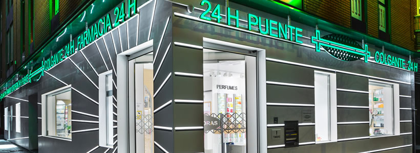
Extending for more than 35 linear metres, the storefront is one of the defining elements of the project. Its design responds to both pedestrian and vehicular flows, creating a highly visible architectural frontage that draws attention towards the pharmacy and its interior.
The façade combines white Corian®, backlit elements and black metal plates converging towards the entrance. Conceived to remain visually effective during both daytime and nighttime, the composition uses light and material contrast to reinforce the pharmacy’s identity.
Openings within the storefront also provide views towards some of its key departments, including The Laboratory and The Natural Room, allowing the shopping experience to begin before customers enter the space.
Store planning and customer journey
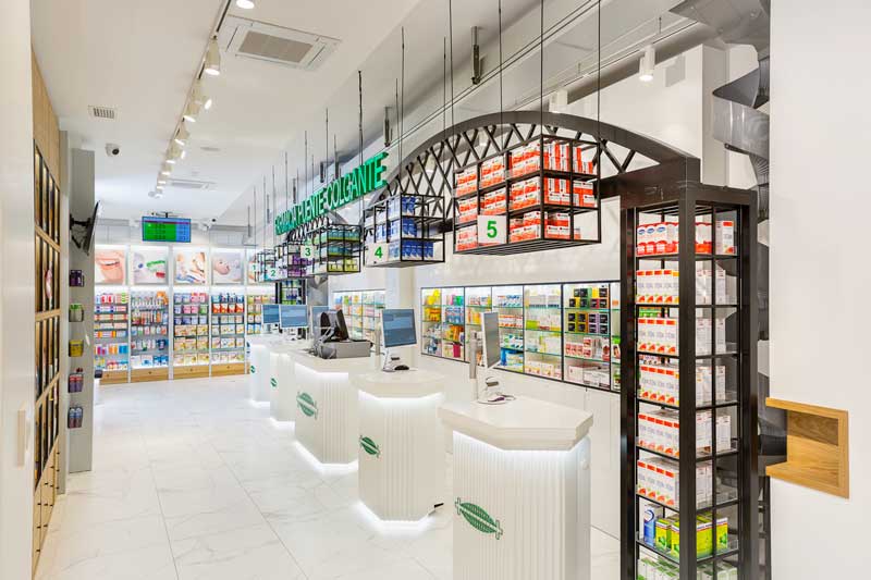
The 130.75 sqm interior is organised around an inverted U-shaped circulation route designed to guide customers through the pharmacy’s different specialist areas.
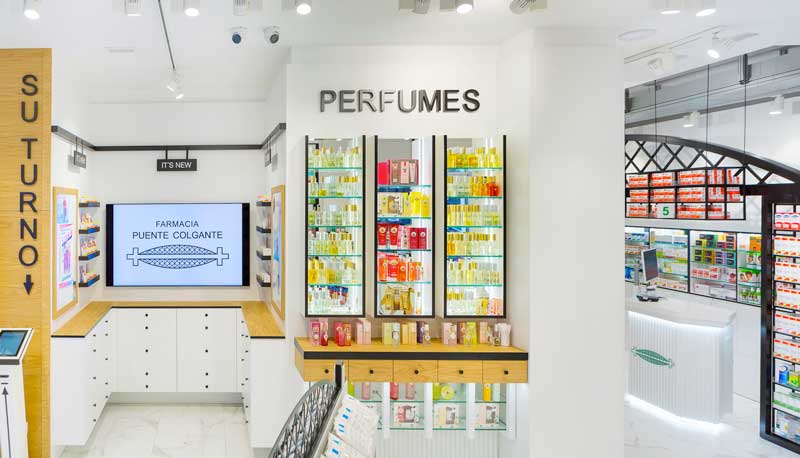
The first section brings together natural medicine, new products, special offers, perfumes, personal care and skincare cosmetics.
The connecting section between the pharmacy’s two main areas accommodates prescription and OTC medicines, alongside the principal cosmetics categories and hair care products.
The final section is dedicated to eye care, children’s products, oral hygiene, orthopaedics and mobility. These categories require a different purchasing process and respond particularly to the needs of children and older customers, influencing their position within the overall layout.

Lighting integrated into the pharmacy design
Lighting contributes both to customer comfort and to the visibility of products and displays.
The furniture incorporates warm LED lighting on different levels, complemented by LED projectors suspended from tracks running around the perimeter of the ceiling. This combination provides general illumination while accentuating specific merchandising areas.
The storefront required a dedicated technical lighting solution. Each Corian® element is milled on its inner surface and fitted with integrated LED lighting, allowing the façade itself to become part of the pharmacy’s nighttime identity while addressing the need for a protected installation.
Materials: warmth and visual clarity
The material palette is designed to create a contemporary environment combining a professional character with a warmer and more natural atmosphere.
An imitation-marble ceramic floor is combined with furniture made from oak, lacquered MDF, mirrors, glass and metal. The contrast between these finishes helps differentiate functions while maintaining a consistent visual language throughout the pharmacy.
Materials, lighting and furniture therefore work together as part of the customer experience rather than as independent decorative elements.
Visual merchandising and the bridge concept
The suspension bridge concept reappears in the presentation of medicines. An iron bridge structure, combined with an automated medicine delivery system, transforms this functional area into a distinctive visual merchandising feature directly connected with the identity of Puente Colgante Pharmacy.
Other product categories adopt a more restrained approach.
The natural products and cosmetics areas use furniture inspired by a library, while the mobility and orthopaedics section introduces a more industrial language, prioritising visual clarity and product accessibility rather than display density.
Marketing-Jazz also developed a graphic system based on artistic illustrations. In the natural medicine area, the imagery takes inspiration from major organs of the human body – including the lungs, heart and brain – and explores their relationship with nature.
Through these elements, branding, store planning, materials, lighting and visual merchandising are brought together around a single architectural reference: the suspension bridge that gives the pharmacy its name.
Design: Marketing-Jazz
Area: 130.75 sqm
Location: Valladolid, Spain
Photo: Luis Sanchez de Pedro Aires