
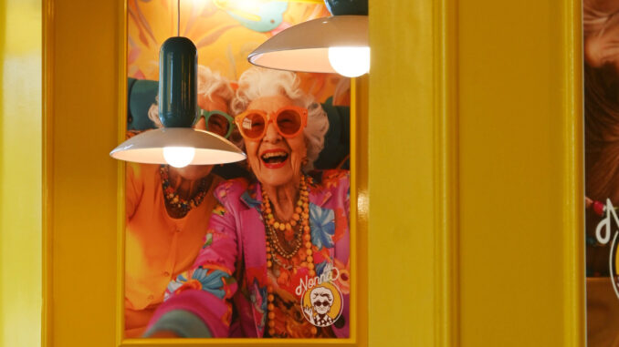
Located in Milan’s CityLife district, Da Nonna is the new restaurant designed by Nick Maltese Studio, reinterpreting Mediterranean domestic imagery through an interior design project defined by vibrant colours, cultural references and a strong narrative dimension. The space translates the idea of family hospitality into a contemporary environment where memory, pop culture and atmosphere coexist within a coherent and distinctive design language.
The figure of the nonna becomes the narrative core of the experience
The concept is built around the symbolic figure of the nonna, interpreted as an archetype of conviviality and dining culture. The project does not simply evoke a nostalgic image, but reworks this reference through a contemporary approach that transforms the restaurant into an experiential space.
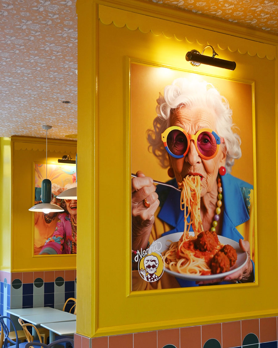
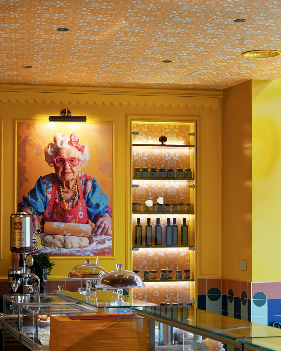
The identity of the venue takes shape through a series of large portraits representing the nonna in everyday situations reinterpreted with irony. These visual elements become an integral part of the project and help construct a narrative that accompanies visitors throughout their time in the space.
Interior design uses graphic and decorative components as tools to reinforce the character of the restaurant, creating a direct relationship between environment, atmosphere and identity.
Colour organizes the entire interior design project
The interior composition develops through a conscious use of colour, which becomes the main design device. Shades of yellow define walls, frames and surfaces, interacting with accents of pink, blue and mint green distributed across furnishings and finishes.
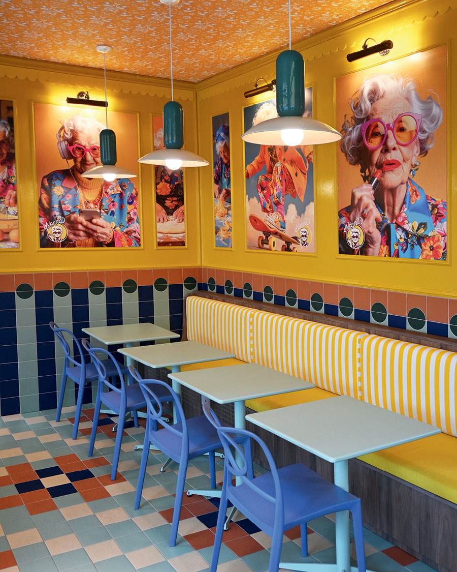
The colour palette creates visual continuity between the different areas of the restaurant and contributes to a bright, immediately recognizable environment. Striped banquettes, pastel-coloured seats and decorative details reinforce the playful character of the space while preserving compositional coherence.
The use of colour is not only aesthetic, but becomes a tool for constructing perceptions, visual hierarchies and relationships between the different components of the interior.
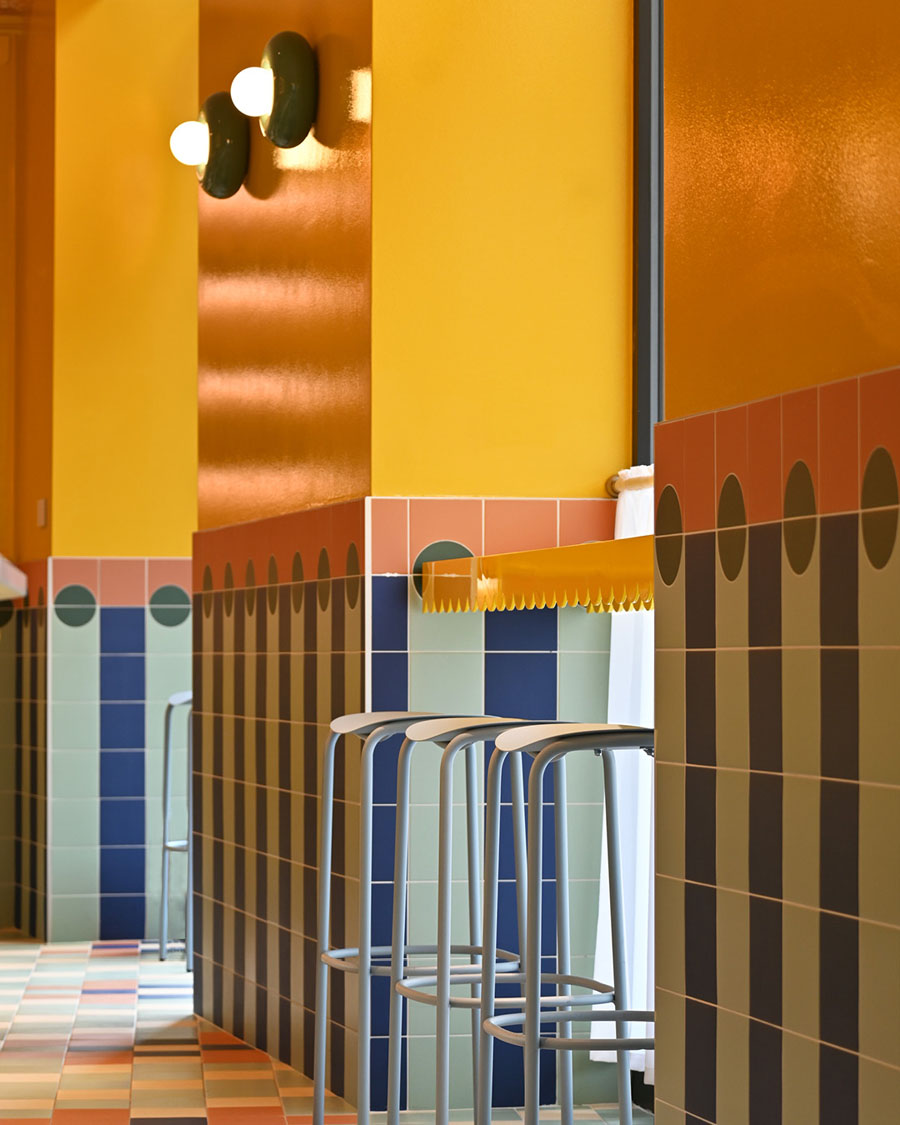
Ceramic surfaces introduce graphic rhythm and Mediterranean identity
Surfaces play a central role in defining the project. Ceramic tiles create geometric patterns across walls and floors, introducing a strong graphic component within the space.
The combination of pastel tones, colour contrasts and regular geometries recalls the imagery of Mediterranean kitchens and helps build a connection between domestic memory and contemporary design language.
The finishes become active elements in the construction of the restaurant’s visual identity, contributing to the continuity between architecture, furnishings and decoration.
Lighting enhances atmosphere, materials and scenographic elements
Lighting plays a decisive role in shaping the interior atmosphere. Suspended lamps and retro-inspired fixtures define the space through a sequence of luminous accents that guide the visitor’s gaze.
Particular emphasis is placed on the large decorative portraits, highlighted by dedicated lighting elements that reinforce their scenographic value and presence within the interiors.
Light also highlights surfaces, colours and architectural details, contributing to the readability of the space and to the dialogue between the different components of the interior design project.
Decorative motifs and pop references define a distinctive environment
The project alternates elements connected to the domestic sphere with solutions expressed through a more contemporary language. Floral motifs on the ceiling interact with the geometries of the ceramic surfaces and with the decorative frames that characterize the walls.
Scalloped details, intense colours and the recurring presence of the nonna figure create a balance between memory and pop culture. This dialogue between different references generates a space that goes beyond the function of a simple restaurant to become an environment capable of expressing a precise design identity. Within Nick Maltese Studio’s research into hospitality design, Da Nonna sits alongside other Milanese projects such as OTIVM, interpreting the theme of dining through a different expressive and narrative language.
With Da Nonna, Nick Maltese Studio creates a project that interprets Mediterranean hospitality through colour, light, materials and visual narrative, transforming the restaurant into a strongly characterized space within the urban context of CityLife.
Credits
- Location: CityLife, Milan
- Creative concept, art direction and installations: Nick Maltese Studio
- Interior fit-out: Augusto Contract
- Suppliers: Spaghetti Wall; Quintaessenza; Ferroluce; Maytoni
- Photo credit: Isabella Valarezo