
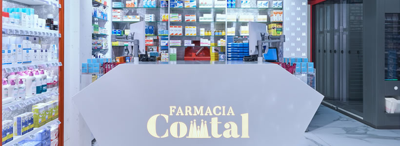
Located in Turó Park, Barcelona, Comtal Pharmacy occupies a compact 70 sqm space whose design combines brand identity, product display and customer experience. Developed by Marketing-Jazz, the project transforms the pharmacy into a highly recognisable environment, using architecture, colour, materials and visual merchandising to establish a direct connection with the city.
The project continues a previous collaboration between Marketing-Jazz and pharmacist Esther Garros, following the redesign of her Garros Pharmacy in Lleida. For the Barcelona location, the design responds to a different urban and commercial context, addressing a clientele that combines long-standing local customers with an international business community.
A pharmacy identity connected to Barcelona
The identity of the pharmacy was developed around the name Comtal, a reference to Barcelona’s historical designation as the Ciutat Comtal. From this connection came the concept “Health for the whole city since 1948”, linking the pharmacy’s history with its location and positioning.
Barcelona therefore becomes part of the visual language of the project. References to the city and its architecture are translated into graphic and spatial elements rather than reproduced literally.
This approach allows the brand identity to extend beyond signage and communication, becoming part of the architecture and product presentation.
Pharmacy design for a compact 70 sqm space
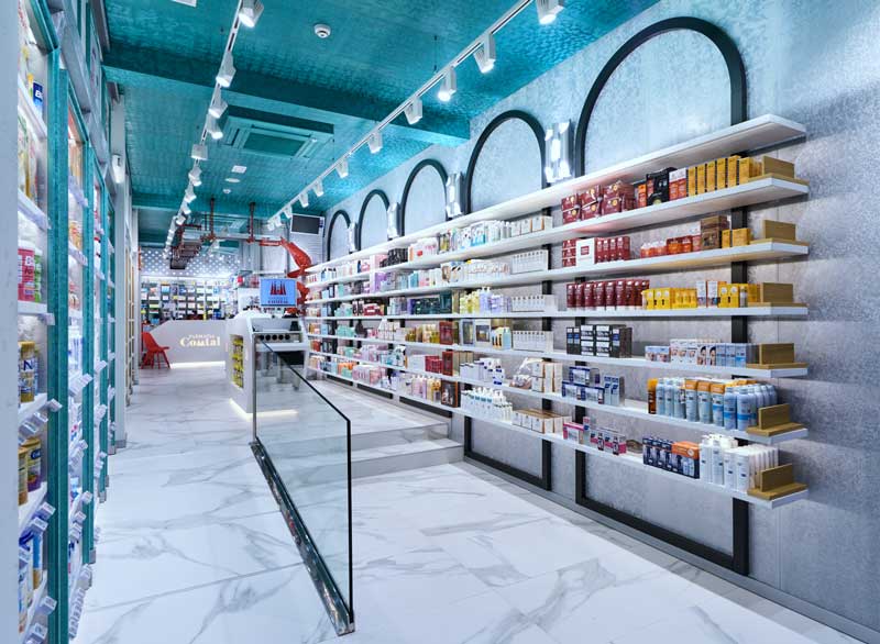
One of the main challenges was the limited floor area. With only 70 sqm available and no dedicated stockroom, the project had to maximise the space accessible to customers while maintaining the operational requirements of the pharmacy.
The long, narrow floor plan — just over 3.5 metres wide in some areas — is organised as a continuous retail sequence. Rather than treating this configuration simply as a constraint, the design uses the walls as the principal merchandising surfaces, leaving the central circulation route visually open.
Product categories are distributed through different display systems, creating variation along the length of the pharmacy while maintaining clear visibility of the merchandise.
Architecture and product display
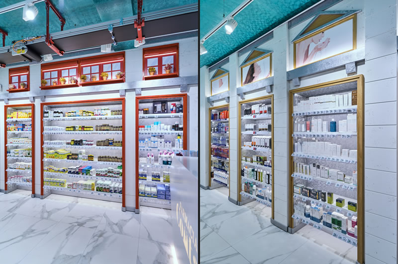
The interior combines several architectural languages within a coherent composition. Some wall displays are framed by bold red profiles, while others use more classical geometries defined by metallic details and illuminated shelving.
Elsewhere, large black arches frame the walls and introduce a recurring graphic element that gives rhythm to the elongated space.
Above, the turquoise-toned ceiling contrasts with the predominantly pale surfaces below. Tracks, lighting equipment and technical components remain visible, introducing a more industrial layer into an interior otherwise characterised by carefully controlled display architecture.
The floor uses large-format ceramic surfaces with a marble-like appearance, reinforcing the brightness of the interior and providing a neutral base for the stronger colours and metallic details.
Visual merchandising as part of the interior
Visual merchandising is integrated directly into the architectural concept rather than added as a separate layer.
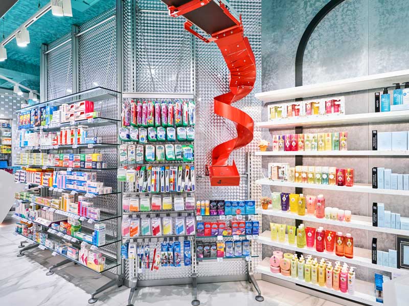
The product display is organised according to different spatial identities. On one side, the shelving draws inspiration from architectural elements associated with the Turó Park area. Other sections use illuminated niches, linear shelves and contrasting frames to distinguish categories and create visual hierarchy.
The result is a sequence of merchandising environments rather than a uniform wall of products.
Particular attention is also given to the pharmacy’s automated system. Instead of concealing the technical component, the project makes it visible through a distinctive red structure, turning an operational element into part of the interior composition.
Materials, colour and lighting
Materials and colour play an important role in differentiating the pharmacy from a conventional healthcare retail environment.
Light surfaces are combined with lacquered elements, metallic details, translucent textures and stronger chromatic accents. Red, turquoise, black and gold-toned profiles create visual contrasts while helping to distinguish different parts of the space.
Lighting is closely integrated with the merchandising system. Track-mounted spotlights provide general and accent illumination, while integrated lighting highlights shelving and product displays.
The interaction between light, reflective materials and colour reinforces the perception of depth within the narrow floor plan and contributes to the overall identity of Comtal Pharmacy.
A pharmacy where identity and merchandising converge
Comtal Pharmacy demonstrates how pharmacy design can integrate branding, architecture and visual merchandising within a limited footprint. The 70 sqm interior uses its elongated configuration to create a sequence of differentiated display areas, while colour, lighting and architectural references establish a recognisable connection with Barcelona.
Rather than treating product presentation as an independent component, Marketing-Jazz incorporates it into the spatial language of the pharmacy, making merchandising, customer circulation and brand identity part of the same design system.
Project: Comtal Pharmacy
Location: Barcelona, Spain
Area: 70 sqm
Design: Marketing-Jazz
Strategy, creativity, design and general management: Carlos Aires
Sketches and artistic illustrations: Elena de Andrés
Corporate image: Laura Sánchez De Pedro
Topographic survey: Mercedes Robles
Technical design: Xiang Sun
Visual merchandising: Comtal Pharmacy Team and Carlos Aires
Photo credit: Ikuo Maruyama