
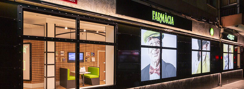
Located in the heart of Reus, Spain, Farmacia del Carrilet presents a retail design project where storytelling, functionality and identity converge into a cohesive spatial experience. Designed by Marketing-Jazz, the pharmacy translates the metaphor of travel into an environment that is both inclusive and clearly structured.
The concept originates from the vision of pharmacist Lucia Conde Peiro, who aimed to create a welcoming space for a diverse community, including residents, families and migrants. The guiding idea — life as a shared journey — becomes the narrative backbone of the project, shaping both spatial organization and visual communication.
A pharmacy concept inspired by travel
The concept “All aboard the Health Express” defines the entire project. Rather than being applied as a decorative layer, the railway-inspired theme acts as a structural principle that informs layout, materials, furniture and graphic elements.
This approach allows the space to maintain coherence across all levels, transforming the pharmacy into an immersive environment where identity and function are closely integrated.
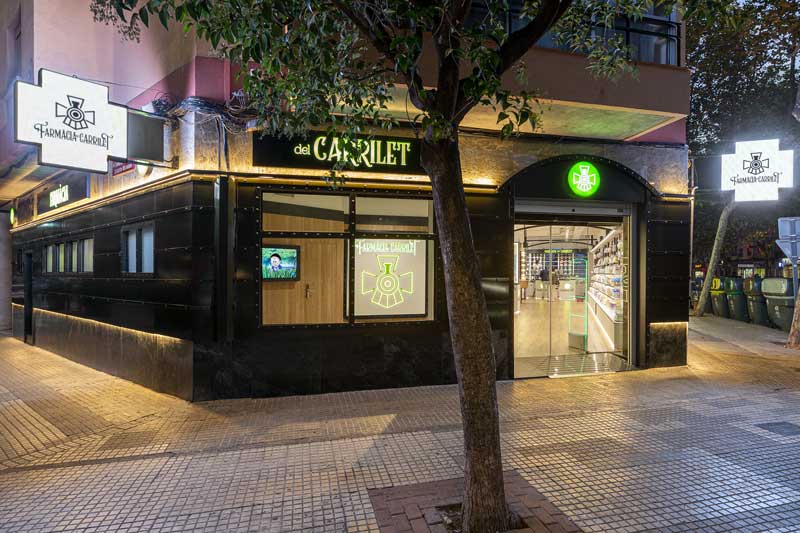
The façade as an urban device
One of the most distinctive features of the project is the façade, extending over 20 meters and conceived as the side of a train. Metal panels, rivets, structural profiles and illuminated inserts create a strong and recognizable presence within the urban context.
Backlit images portraying different people reinforce the idea of inclusivity, while the locomotive element acts as a focal point. The façade establishes a direct relationship between the interior narrative and the surrounding public space.
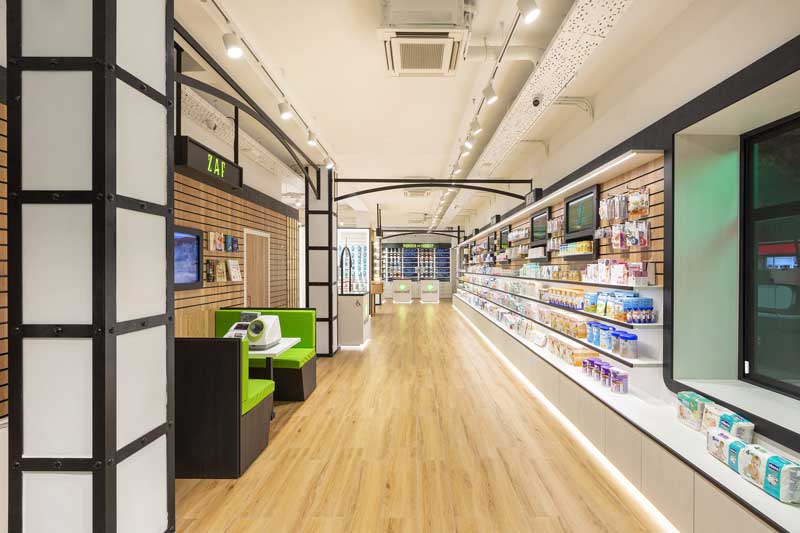
Entrance and spatial orientation
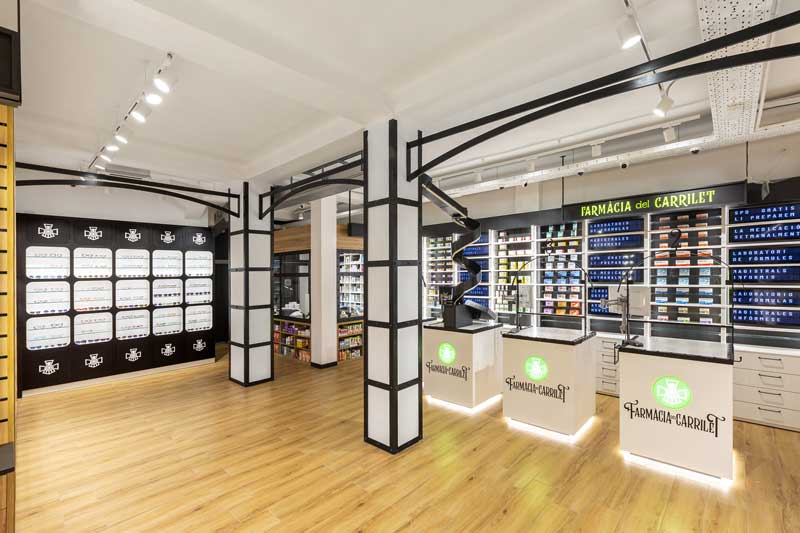
Inside, the entrance introduces a warm and clearly organized environment. Metal columns and arches evoke railway architecture, while wood finishes and LED lighting contribute to a welcoming atmosphere.
The layout is designed to enhance orientation and readability. Visitors can easily identify functional areas such as waiting zones, service counters and product displays. The project demonstrates how storytelling can be integrated into pharmacy design without compromising usability.
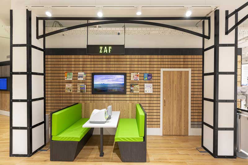
Waiting areas and comfort
The ZAF area is conceived as a waiting space inspired by train carriages. Comfortable seating, a screen displaying moving landscapes and a blood pressure station transform waiting time into a more relaxed experience.
Services are seamlessly integrated into the spatial narrative, maintaining clarity while enhancing comfort. This approach positions the pharmacy not only as a retail space but also as a place for interaction and well-being.
Display systems and product organization
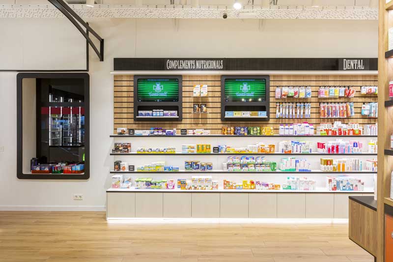
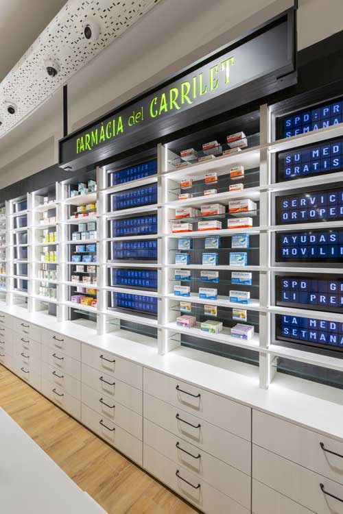
Along the right wall, a three-level display system organizes products in a clear and structured way. Digital screens framed as train windows occupy the upper section, while central shelves present products and lower cabinets store bulkier items.
This configuration ensures visual order and supports category organization, including childcare, women’s health, oral care and supplements. The integration of digital and physical elements reinforces communication throughout the space.
Accessibility and inclusive design
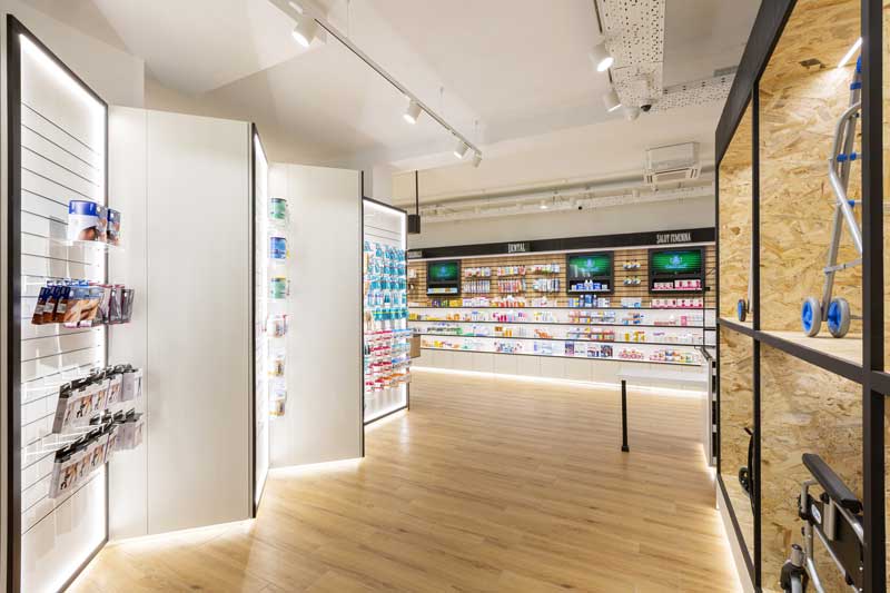
Accessibility plays a central role in the project. A dedicated mobility area near the entrance includes a lowered counter for wheelchair users, display systems for mobility aids and a layout designed to improve product visibility.
Rather than being treated as a secondary feature, accessibility is fully integrated into the design, contributing to a space that balances functionality, comfort and aesthetic consistency.
Specialized areas and customer experience
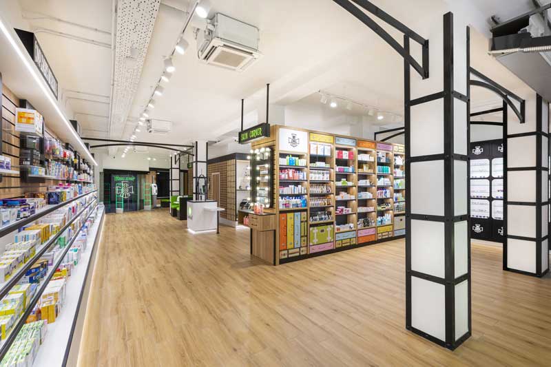
The pharmacy is organized into thematic zones that align with the overall concept. The Skin Stop area, dedicated to cosmetics, functions as a “stop” along the customer journey, featuring a testing station and mirror.
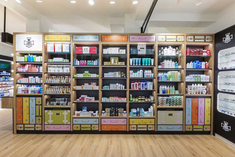
The Dermo Wall transforms product display into a visual installation, while the optical area uses a grid inspired by train windows to organize eyewear. Each area maintains narrative continuity while ensuring clarity and usability.
Integrated services and automation
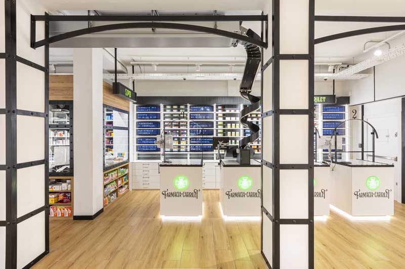
A key feature of the project is the SPD (personalized dosage system) area, which is fully integrated and visible within the pharmacy. The robot, preparation room and counter are combined into a single operational space.
This solution reflects the evolution of pharmacies towards more complex service models, where automation, efficiency and customer interaction coexist within the same environment.
Lighting, materials and visual communication
Lighting plays a crucial role in shaping the atmosphere and guiding the customer journey. LED strips integrated into furniture and adjustable spotlights highlight key areas and enhance spatial perception.
Materials such as wood-effect porcelain, melamine and Corian provide durability while maintaining a balanced aesthetic. The project also combines printed graphics and digital media, with backlit visuals and multiple screens supporting communication across the space.
Visual merchandising and spatial coherence
The visual merchandising strategy is based on clear and structured product groupings, often organized in sets of three. This approach improves readability and reinforces visual order.
The strength of the project lies in the integration of layout, furniture, communication and narrative. Farmacia del Carrilet demonstrates how a strong concept can support both customer experience and operational efficiency within a pharmacy environment.
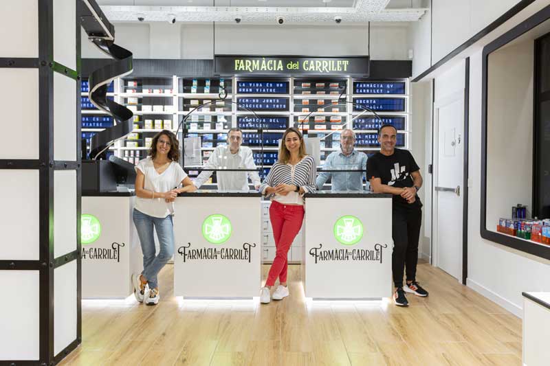
Location Reus, Spain
Area 150 sqm
Design Marketing-Jazz, Carlos Aires
Architect German Mínguez Martínez
Builder GM Proyecta Coordinación y Contratas
Furniture Muesco, Jose Antonio Sánchez
Lighting Leds Live, Nuria Torrents
Shopfront and signage Sintek, Pablo Lence
Photo credit Lupe Clemente