
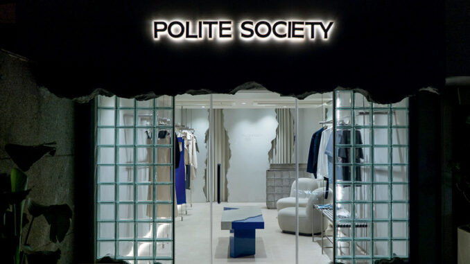
A spatial language between subtraction and materiality
The minimalist retail design project for the Polite Society store is defined by an approach based on subtraction, where space is shaped through a controlled use of materials and light. The interior is conceived as a neutral system, marked by continuous surfaces and light tones, designed to ensure a clear reading of the product.
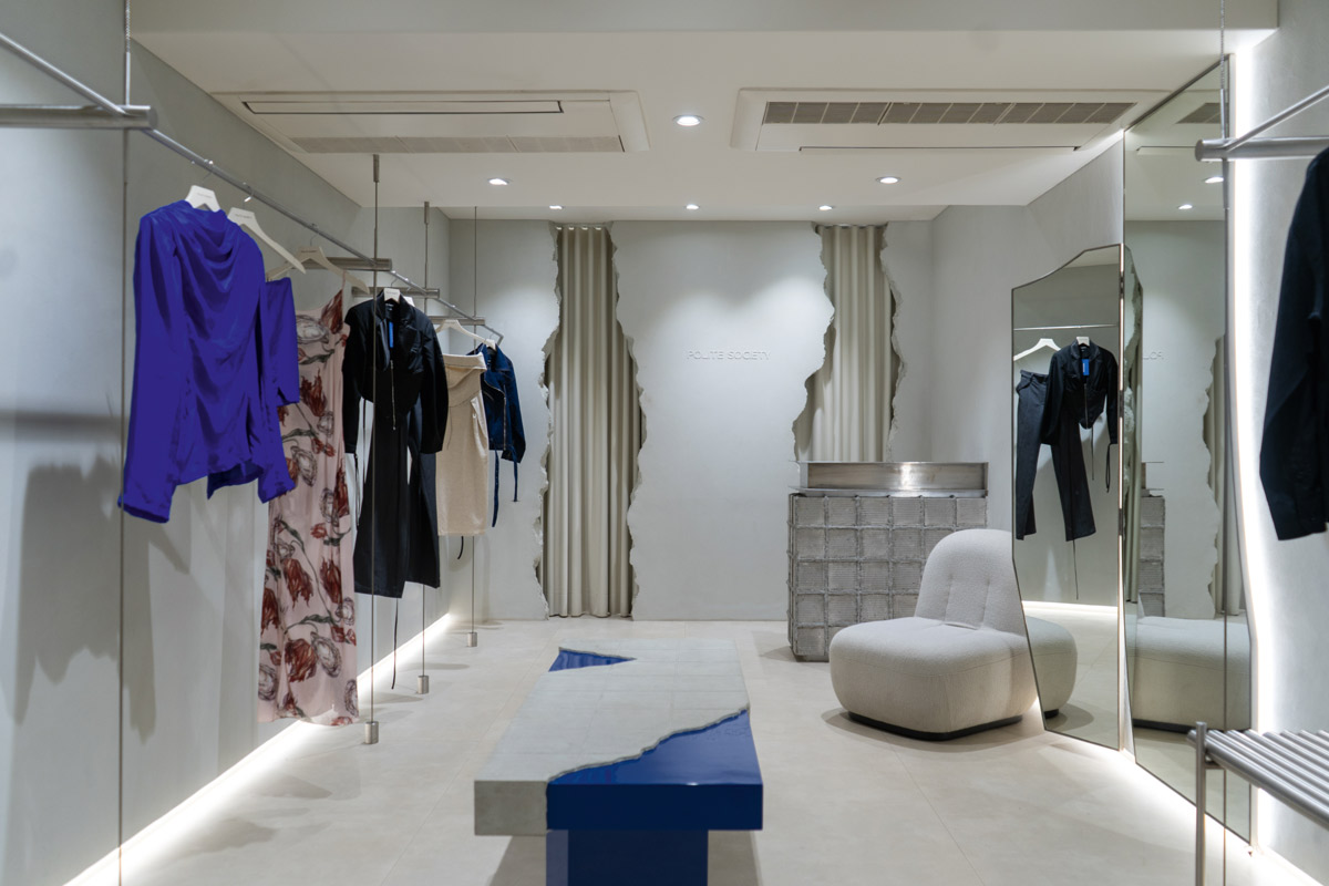
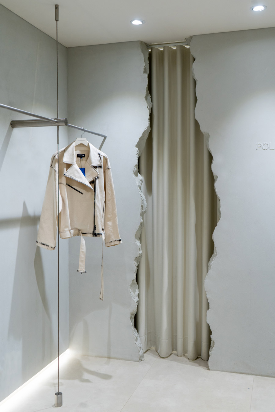
The walls take on an active role in the spatial composition. Their deliberately irregular material treatment introduces openings that interrupt the continuity of the plaster and reveal vertical structural elements behind. This device creates a layered perception of the space, establishing a relationship between finished surfaces and exposed parts.
Materials and display systems
The material palette is limited to a small number of elements: plaster, metal and glass. This reduction allows the project to maintain visual coherence and perceptual control throughout the store.
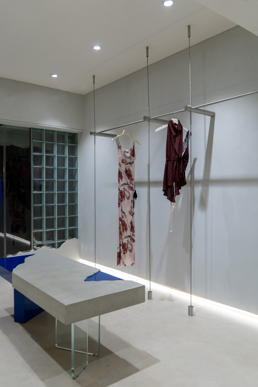
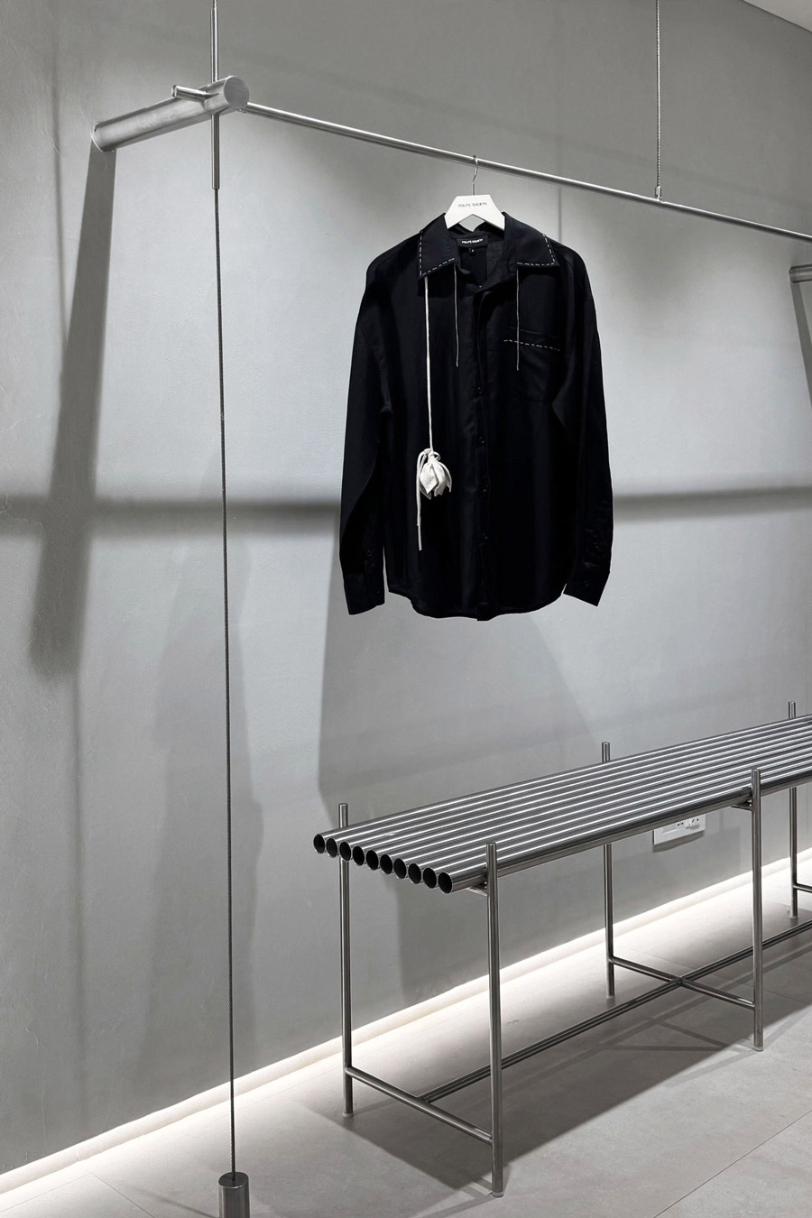
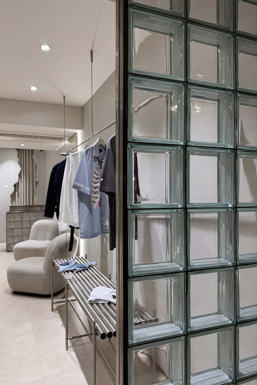
The display systems are made of tubular metal and configured as suspended structures supported by cables. Their visual lightness helps preserve spatial continuity and reduces the impact of the furnishings on the overall volume.
The garments are distributed in a sparse arrangement, avoiding excessive concentration. This approach gives each displayed piece greater visual autonomy, reinforcing the direct relationship between product and space.
Layout and spatial organization
The store layout follows a linear configuration, with display elements arranged along the perimeter. The center of the space remains open, allowing for fluid movement and an immediate reading of the interior.
This organization supports spatial clarity and reduces visual interference. The path is not rigidly defined, but develops intuitively, guiding visitors through a sequence of focal points.
Lighting and perception
The lighting is designed to ensure uniformity and control of the surfaces. Ceiling-integrated fixtures diffuse a soft and even light, avoiding strong contrasts.
Reflective surfaces and mirrors amplify the depth of the space, contributing to a broader perception of the interior. In this context, light is not a scenographic element, but a tool for spatial definition.
Design elements and identity
Some elements emerge as defining devices. The cash counter is conceived as a compact volume, finished with a material texture consistent with the rest of the store. The display tables introduce punctual variations without altering the overall balance.
The irregular openings in the walls are the project’s main identifying feature. They are not decorative gestures, but devices capable of articulating the space and building visual depth.
Façade and relationship with the exterior
The façade extends the interior language, maintaining coherence between the envelope and the retail space. The use of glass blocks introduces a filtering surface that allows light to pass through while preserving a degree of opacity.
The openings, treated with the same material approach as the interior walls, create perceptual continuity between inside and outside, reinforcing the project’s identity.
Location: Bandra, Mumbai
Design: Studio Hasta
Lead architect: Nishil Shah
Photo credits: PSB_Photo Docket