[button link=”https://www.arredanegozi.it/2018/05/progetto-farmacia-ainhoa-studio-marketing-jazz/” icon=”none” target=”” color=”a30b0b” textcolor=”ffffff”]TESTO ITALIANO[/button]
Light & Colour = Health & Emotion: this is the idea that underpins the new conceptual design of Ainhoa Pharmacy. It is the common thread that runs through the product presentation, the shopping experience and the clarity of image as a unique sales proposition of the brand of this pharmacy.
The pharmacy is located in an open Shopping Centre in Orihuela (Murcia, Spain), in a well-known summer resort on the Spanish coast. Senior citizens from northern Europe come to enjoy long periods of their retirement here. Spain is their paradise.

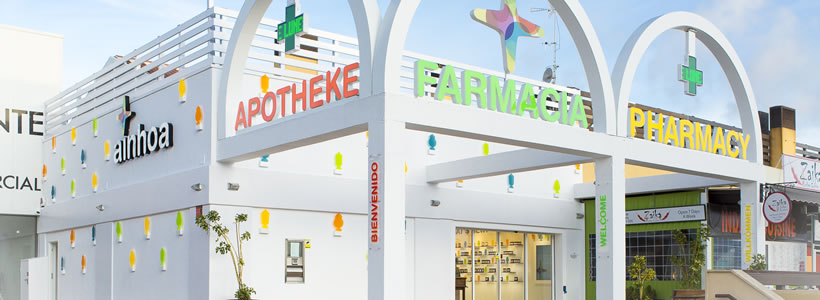
The use of colour in the sign and store front surprises and excites. The layout is designed to create a clear, easy and highly professional shopping experience, that integrates natural medicine with pharmacological medicine in the same business outlet. A pharmacy that pays special attention to new products, medicines, technology and retired people.
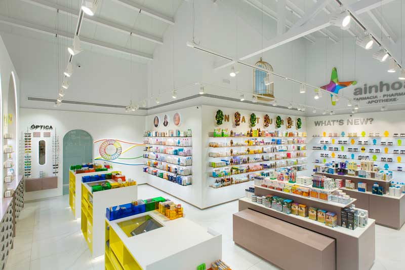
The first thing at the entrance is the new items wall, and next to it the natural remedies wall. The combination of new with natural creates a very contemporary image and shopping experience.
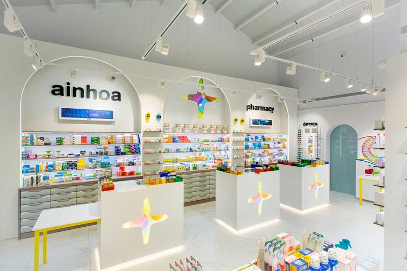
In the centre, the two large islands organize the customers’ movements while at the same time highlighting promotions and special offers.
The main wall is devoted to presenting medicines, which are the core drivers of the business. To the left of this wall, and thinking about senior citizen clients, there is an orthopaedic wall and items for mobility assistance. And, very close to hand, a counter for wheelchair-bound customers and a waiting bench. On the right hand side of the natural products wall is the cosmetics wall, thereby reinforcing the importance of beauty as part of wellness. Next to this area for personalized dispensing of medication and in full view is a small area for optics as a finishing touch.

The star of this project is Light. The design of the displaying system and communication bases on an LED lighting rail. An original design that was custom-made for this project. Light is literally what sustains the product presentation, the conveying of the categories and the positioning of the testers.
In addition, LED lighting strips are used to frame the architecture of the arches and other volumes, thereby creating a unity in the image created by the light. In addition there is an illumination feature to the front of the products by fitting swivelling LED projectors situated at the front of each of the walls where products are displayed.
Outside, on the store front, custom made lamps on multi-coloured methacrylate silhouettes inspired by traditional Albarelli. A selection of materials have been created to give the impression of being in a pharmacy that is at once “professional, natural, economical, modern and sophisticated”.

Large imitation marble porcelain floor tiles contribute a renovated experience with a classical and professional touch. Melamine walls with a white sycamore finish provide a natural texture and elegance to the overall impression. Minimalist designed 1 cm thick shelves with various finishes made of MDF provide lightness, warmth and the perception of frugality in the product presentation.
The use of materials such as Corian® for counters and methacrylate in signboards provide modernity and professionalism. The metal coated finishes on the chipboard units for skincare and orthopaedic products add an air of sophistication to the products.
Location Orihuela, Murcia, Spain
Area 80 sqm
Creativity, design and overall direction Carlos Aires
Artistics illustrations and sketches Elena de Andrés
Branding Natalia Aires
Project Management Mercedes Robles
Technical design Beatriz Alonso
Visual Merchandising Carlos Aires and Mercedes Robles
Photos courtesy Luis Sanchez de Pedro Aires
by AN shopfitting magazine no.144 ©


