[button link=”https://www.arredanegozi.it/2019/04/marketing-jazz-progetta-la-farmacia-comtal-di-barcellona/” icon=”none” target=”” color=”a30b0b” textcolor=”ffffff”]TESTO ITALIANO[/button]
Four years ago, Marketing-Jazz re-designed Esther Garros’s pharmacy in Lerida, which was a resounding success in commercial terms.
One of Esther’s dreams was to be able to run a leading pharmacy in Barcelona. Since 1948, the pharmacy has stood in Turó Park, one of the most exclusive districts of Barcelona. A clientele composed of a mix of families who have been regular customers all their lives and a new business class with foreign senior executives. The pharmacy had to convey an image of contemporary international luxury.
To create a brand, it is very important to have a good name and an idea about the story you want to tell. The name would represent the city and the symbol of Barcelona; so, came origin the brand name “Comtal” which in Castilian Spanish is “Condal”, that is to say, “La Farmacia de la Ciudad Condal” (the Pharmacy of the City of the Counts).
This idea originated the slogan: “Health for the whole city since 1948″. And this was “The Big Idea”, the concept on which to build the retail project. The image representing this idea was the Sagrada Familia, the most emblematic symbol of the city of Barcelona.
One of the strategic principles of the slogan “Comtal Pharmacy, health for the whole city” is to set it up to differentiate the brand, to grow, not just in terms of space but also in terms of the services it offers.
Retail design
The major challenges of designing this commercial space were:
- To provide pharmacy with the maximum visibility, presence and commercial attraction, without depending on the storefront
- To be able to offer 95% of the space to the customer. No space was available for a store room
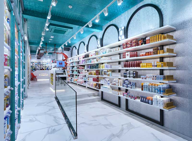
- To differentiate the product presentation and the shopping experience in a premise with “passageway” floor with a width of just over 3.5 meters.
The approaching retail project is based on making the most of each and every zone that makes up the commercial space: Store planning, store front, window display, entrance, sales area, changing room, waiting room, show cases, impulse buying, creating a clear image of quality that merges design with product presentation.
Key aspects of the project are the materials used for the points of contact with the customer, the colour to use, in order to produce visual excitement, and lighting that makes you feel good. Every aspect has been carefully dealt with to convey the sensation to be in a luxury pharmacy.
Ceramic tiled floors from Italy, imitation marble, provide a feeling of well-being as soon as we enter. Lacquered wood furnishings with a ‘frosted effect” offer light and a silky texture. The fact that no two panels are the same give the impression of luxurious craftsmanship.
Counters made of Corian quartz and corporate walls made die-punched chipboard with back-lighting, provide a feel of modernity and technology to extend the service and contribute to the project as a whole.
Visual Merchandising
The product presentation is based on three main themes:
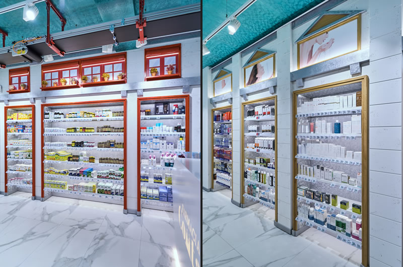
- The concept “Health for the whole City” is based on the wall to the left, and the furniture is inspired by the buildings in the catchment area situated in Turó Park. If one looks closely, one can recognise three clearly differentiated types of buildings
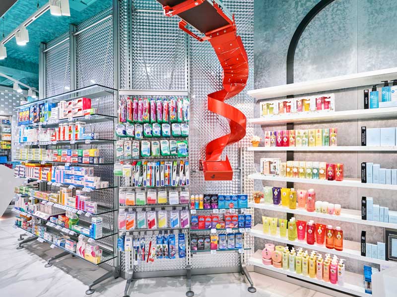
- Customisation and expertise has prominent role. Everything is top quality and everything is in full view. A pioneering feature is the treatment in the presentation of the robot, and the finishes of the ironwork, screws and fittings are lacquered with the corporate colour. This is achieved down to the finest detail, for instance in the weighing scales
- 1970s. The colour of the pharmacy: the wall on the right and some of the lighting details such as the wall lamps are inspired by the 1970s, a reference to the origin of the former pharmacy
And that sums up for the latest designer pharmacy: Comtal Pharmacy, health for the whole city.
Design Marketing-Jazz
Area 70 smq
Strategy, creativity, design and general management Carlos Aires
Sketches and artistic illustrations Elena de Andrés
Corporate image Laura Sánchez De Pedro
Topographic survey Mercedes Robles
Technical design Xiang Sun
Visual Merchandising Comtal Pharmacy Team and Carlos Aires
Photos courtesy Ikuo Maruyama