[button link=”https://www.arredanegozi.it/2022/09/interior-e-branding-per-una-pasticceria-dalle-forme-sinuose/ ” icon=”none” target=”” color=”a30b0b” textcolor=”ffffff”]TESTO ITALIANO[/button]
“Imagine entering a crunchy cannoncino fresh out of the oven, hear the noise muffled by the softness of the custard cream, immerse yourself in swirls of sweetness, feel the scent of butter and icing sugar” Vanda
Vanda Studio signs the interior and branding for the Cannoncino pastry shop in Piacenza
When it comes to branding, you can’t ignore the client’s clear and precise requests. From choosing a name, logo, and location to renovating and designing the interiors, Studio Vanda created this “Total Concept” for a young pastry chef who dreams of preparing and selling cannoncini, an Italian sweet delicacy whose crispy pastry is filled with luscious cream.
Once the location had been determined, the most interesting part was conveying the brand through the name and the uniqueness of the product through the location. If you’re not familiar with it, the cannoncino has a spiral-shaped shell which is a food architecture in itself: such shape makes the pastry “structurally” resistant, so you use less dough and can fill it with a cream that is heavier than the pastry itself. This is why such a peculiar shape was used to draw both the name “Cannoncino” and the brand logo, which is a stylized representation of the Italian pastry.
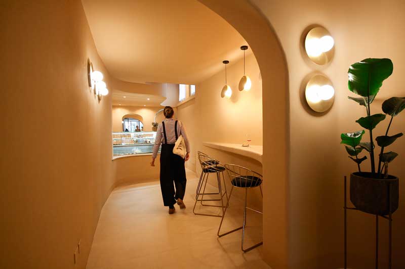
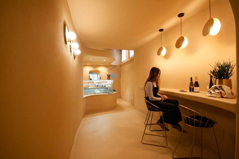
Sinuous and soft shapes
From then on, defining the characteristics of the location as an expression of the brand became paramount. Inspired by the organic architectures of Rudolf Steiner’s Goetheanum in Dornach, the Studio decided to use sinuous, soft shapes, replacing every corner with curves. The result is an ambiance that feels like entering a muffled place where you can escape the noises and stress of the world for a “sweet” rest. In addition to the organic shapes, the space has a very welcoming feeling due to the use of a single color across all surfaces, creating a play of shadows and chiaroscuro: it’s called beige or custard, which is the color of cannoncini.
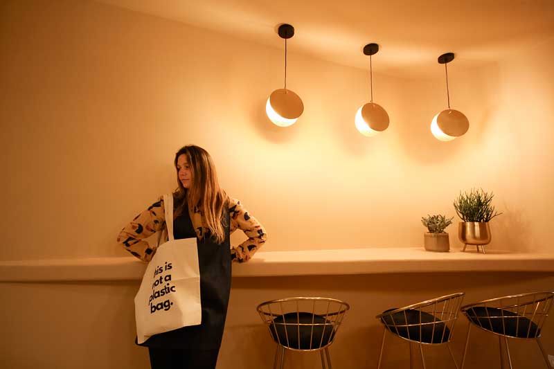
This play of soft lines and asymmetrical curves is enhanced by brass suspensions with a circular shape whose light is diffused indirectly, never directly. In the same vein, the materials for the furniture are metallic and bronzed and never contrast with the background but instead blend in and reflect it, creating points of light.
Client: Cannoncino
Project: Vanda Studio
Location: Piacenza (Italy)
Bar Stools: Homecom Mirror: Westiwingnow
Lighting: Mazzolaluce, Amlux, Kavehome, Westiwingnow
Photo Courtesy: Valentina Elmiger
Vanda Studio
Valentine Elmiger and Aurora de la Fuente started VANDA in 2013, and since then their creative journey has led the studio to grow continuously by expanding skills and professionalism. VANDA is a multidisciplinary studio that offers a wide range of tailor-made solutions for retailers, hotels, private clients, and companies: from concept to creation, from product design to prototyping, from corporate identity to digital communication, so as to achieve a convincing and always innovative result..
by AN shopfitting magazine no.170 ©