[button link=”https://www.arredanegozi.it/2016/05/concept-farmacia-i/” icon=”none” target=”” color=”a30b0b” textcolor=”ffffff”]TESTO ITALIANO[/button]
The concept of I+Farmacy rests on a simple idea brand: unity is strength.
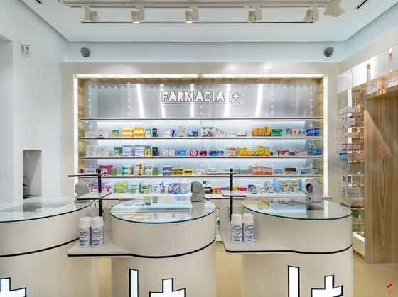
Each pharmacy is represented by a cross. The lay out and the distribution space is based on different categories of health, considering purchasing times and types of customers.

Freedom of movement invites the customer to enjoy the shopping experience based on specialization in the supply of health products and services. Where you can find in the same space medical, beauty, nutrition and natural medicine.
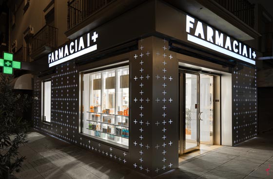
All Farmacia I+ stores are designed with what might be called “Lego concept” so that the design can be adapted to the surface, both 30 sqm pharmacy as one of 300 sqm.
Carlos Aires Creativity, design and overall supervision
Elena de Andrés Ilustration and sketches
Natalia Aires Corporate Identity
Lucia Esteban Technical Design
Silvia Teijeiro 3D design
Ines Moreno Chilhood ilustrations
Silvia Bellisco Visual Merchandising
Ikuo Maruyama Photos
www.marketing-jazz.com
by AN shopfitting magazine no.132 ©